lundi 31 mai 2010

Spoon Graphics | Latest Blog Entry

Spoon Graphics | Latest Blog Entry


Create a Distressed Vector Typographic Poster Design

Posted: 31 May 2010 12:00 AM PDT

Follow this step by step walkthrough of my recent design process for the ‘Spectrum’ poster. Starting with custom made type in Illustrator, we’ll move our vector graphics into Photoshop for some serious distressing with Photoshop brushes, blending modes and more!

Spectrum poster

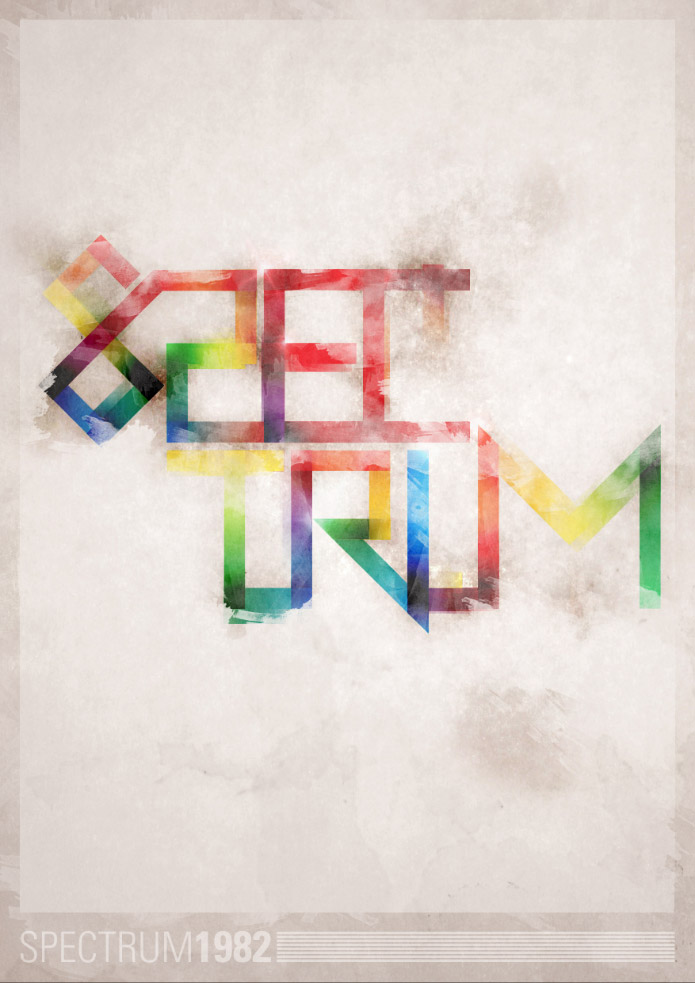
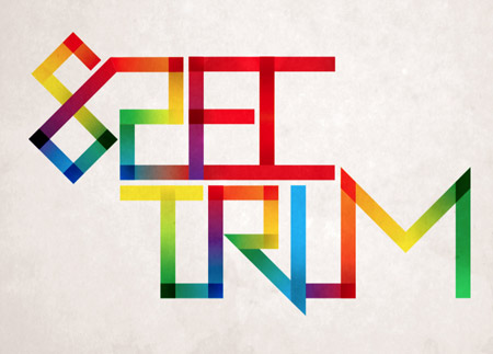
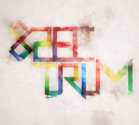
The Spectrum poster takes inspiration from the old ZX Spectrum computer of the 80’s, the feature of the design is the custom made abstract type, which is mixed with a full spectrum of colours then grunged up to the max with textures and muted background tones. The overall theme is a cool mix of 80’s retro and modern day grunge.

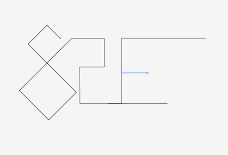
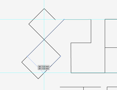
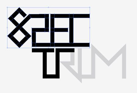
Start work in Adobe Illustrator. Create a new document and begin fleshing out the basics of the custom typography with the Pen tool. Hold Shift throughout to maintain strict angles between each line. The topic of the poster is Spectrum, so the word is designed as recognisable as possible while adhering to the angles of the paths.

Aim to follow each letter from the previous to form one continuous line. However it’s inevitable that extra additions will be needed in places.

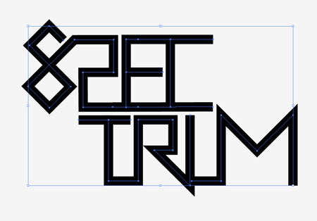
The word Spectrum is split in half to help compose the design and to add that extra touch of abstractism. Finish off the paths until you have a complete and recognisable word.

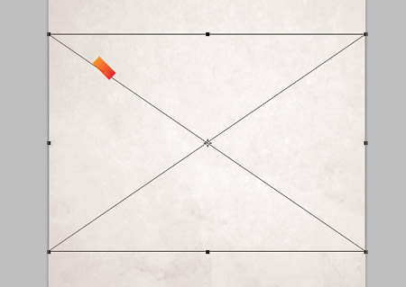
Drag out a few guides to match on key points of the path. Use the Direct Selection tool to drag paths into place to line up the typographic design. Remember to hold Shift to constrain those angles.

Once all the type has been aligned and tweaked, take a step back to review the design as a whole.

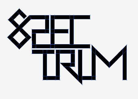
If all is looking good, increase the stroke weight of the path to thicken up the linework.

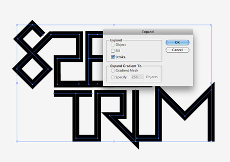
Select the typographic design and go to Object > Expand. Select just the Stroke checkbox to convert the path lines to solid shapes.

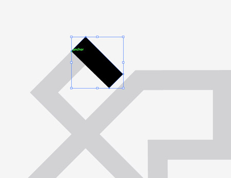
Fill the type with a light grey or reduce the opacity, then lock the object in place (CMD+2). Next use the Pen tool and trace each segment of every letter. Using Smart Guides (CMD+U) will be a huge help in speeding up this process.

Continue tracing segments of each letter. Every time the lines of the type changes direction, create a new shape.

Once the whole selection of type has been traced, unlock the original and move it to one side. We’ll now work on this new version that’s made up of lots of individual pieces.

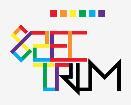
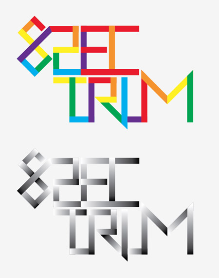
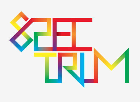
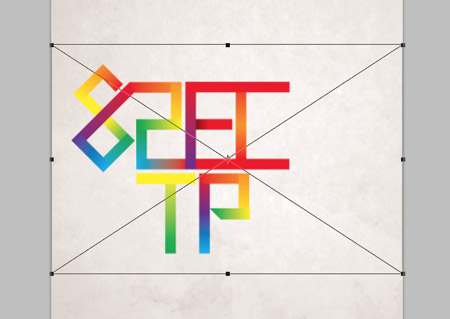
Set out a simple rainbow colour scheme of red, orange, yellow, green, blue, purple. Use this sequence to fill each segment of the type design as you follow the path.

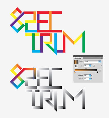
Duplicate the type and move it to one side. Replace the coloured fills with black to white gradients on the duplicated version, then adjust the angles of each gradient so the direction flows according to the orientation of the pieces.

From within the Gradient palette, select the small black and white handles from the gradient editor and replace them with a colour swatch according to the solid colours of the original type design. The first block is red, followed by orange, so the first block’s gradient will run from red to orange. Basically each gradient should flow from the previous colour to the next.

The design should naturally flow seamlessly through the colour spectrum, with the exception of some intersecting shapes, which should be filled with the closest available colour gradient.

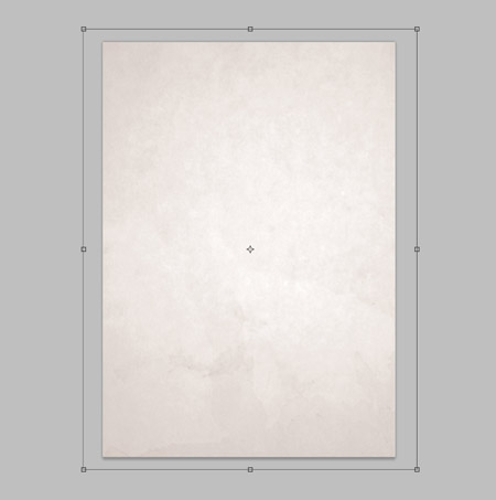
Create a new document in Photoshop, being a poster I’m using A3 dimensions of 297×420mm at 300dpi. Import a subtle background texture, such as this high res paper file from Shutterstock.

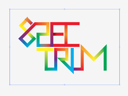
In order to maintain the editability of each segment of the type design, we’ll need to import each piece separately. Draw a box around the design and select it along with the first piece.

Paste the first object into Photoshop and render as Pixels. Switch back to Illustrator and select the next shape and container box.

The container box will ensure all the pieces are aligned exactly, rather than defaulting to the centre of the document. Build up the layers with each individual piece.

Select all the type segment layers and change the blending mode to Linear Burn. Group all the pieces together (CMD+G).

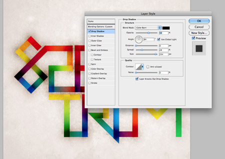
Double click the layer of one piece to open up the Layer Styles window. Add a large Drop Shadow set to Color Burn. Reduce the distance to zero, but increase the spread and size to extend the burnt effect far beyond the edges of the type. Right click this layer and select Copy Layer Style, then paste the layer style onto the rest of the type segment layers.

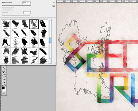
Add a Layer Mask to the Group of type segments, then use a Watercolor Photoshop Brush to rough up the type. Edit the brush to a low opacity to give multiple levels of tone, and rotate the angle from within the Brush options box to add variety to the texture.

Distort the edges of the type slightly by adding cloned areas next to the edges of the words using the Clone Stamp tool. These cloned areas will also be affected by the layer mask of the parent group.

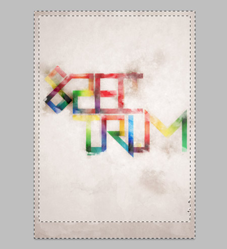
Make a selection around the whole canvas and fill with black to create a border. Change the blending mode to Overlay at 60% to blend the border with the background tones. Add a layer mask and distort the clean edges with a Watercolor brush.

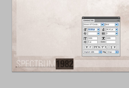
Finally, add a small credit or title to the poster design in the footer area. I’ve titled the design ‘Spectrum’, with the date 1982 being the launch date of the ZX Spectrum.

Spectrum poster

Download the source file

vendredi 28 mai 2010

Spoon Graphics | Latest Blog Entry

Spoon Graphics | Latest Blog Entry


This Week’s Favourites – May 28th 2010

Posted: 28 May 2010 12:00 AM PDT

In this week's roundup of creative goodness, we have a look at the history of design blogs; a tutorial on how to create seamless patterns; a few everyday lessons in freelancing; an awesome illustrative tutorial; and a fantasy photo manipulation tutorial.

Pelfusion

Design blogs have boomed over the past few years, but the idea has been around for years. Pelfusion takes us through history and looks back at how blogs have developed from the late 90’s onwards. I’m honoured to see Blog.SpoonGraphics listed as part of the 2007 generation.

View the article

Design Shack

Repeating patterns are always a useful resource, no matter what you’re designing for. Design Shack takes us through the process of finding and creating your own seamless background textures in Photoshop.

View the article

John O’Nolan

Despite all the helpful advice from freelancing blogs, you never really learn until you experience the ins and outs of self employment as a designer. John O’Nolan shares some useful hints and tips from the lessons he’s learnt over the years.

View the article

Vectortuts

Anything that combines digital artwork and sketches captures my interest straight away, so this tutorial from Vectortuts was right up my street. Follow the two-part walkthrough on how to create a sweet linework and typography combo.

View the article

PSDtuts

It’s always fun to take a break from everyday design work and have fun with some fantasy artwork. This tutorial from PSDtuts explains how to create a surreal fantasy photo manipulation in Photoshop, using various effects on stock photography.

View the article

lundi 24 mai 2010

Spoon Graphics | Latest Blog Entry

Spoon Graphics | Latest Blog Entry


The Making of a Blissful Fantasy Album Art Design

Posted: 24 May 2010 12:00 AM PDT

I’ve been wanting to get stuck into some good old photo manipulation artwork for some time, and after being inspired by the recent Alice in Wonderland movie I had to urge to create my own dreamy fantasy scene. Follow this walkthrough of my design process where I build a blissful fantasy scene with various lighting and colouring effects, then use the artwork as a base for a complete album cover design.

View full size artwork

I knew before starting this little project that I wanted to base the theme on an inspiration from the recent Alice in Wonderland movie. Taking the ideas of thick wooded foliage and a curious girl to build a fantasy scene of my own.

I started out with a spot of research through good old Google Images to refresh my memory and provide some ideas and inspirations.

A forestry background was needed as a base for the artwork, so I scoured various stock photography websites in search of the perfect scene. I had a fairly dark scene in mind, with lots of trees and a covering of greenery on the floor. A strong light source would also have been nice. I eventually found two perfect shots from DeviantArt, one from Spiteful-Pie-Stock, and another from YsaeddaStock.

The first of the two images was imported into Photoshop, duplicated and flipped. This helped produce a long canvas which would lend itself well to being manipulated into cover art later. The two images were overlapped and merged together.

To hide the blatant mirroring of the scene, I imported and overlaid the second forest photograph over the centre. A layer mask added and the scenes carefully blended together.

The dark tree in the second image helped act as a useful boundary between the two images, with just the ground level needing to be merged together with soft erasing.

The light source from the right hand side was chosen as the main feature of the scene, the idea being that rays of sunlight would flood down to focus on a curious female figure. A basic scatter brush was used to paint in some rough particles on the document.

A Motion Blur then converted the particles into realistic rays of light, flooding through the trees and hitting the forest floor.

This layer of sunlight was duplicated a few times, with some layers being changed to Overlay and Soft Light to help illuminate the surrounding greenery.

With the basic scene in place, a young female model was needed as the main focal point of the scene. I had a good idea of the style of character I wanted, so I set out scouring the stock photo websites once more to find a match.

A few potential figures were roughly clipped out and added to the scene to test them in situ. The young girl looking up was a strong candidate, but I decided on an alternative shot of the lady in black.

The full size shot of Bells Falls16 by DeviantArt user *Faestock was brought into Photoshop for some clipping and pasted into the main document.

The figure was scaled to size and moved into place at the end of the sun rays, then the Color Balance adjusted to match the hues of the surroundings.

To better blend to the figure with the environment Dodge and Burn tools were used to highlight and shade areas of the dress according to the light source.

A blue overlay was drawn on the dress area of the figure in order to recolour it in honour of Alice in Wonderland.

The blue overlay layer is changed to Color at 50% to allow the colour to blend with the original tones and creases of the dress.

Another overlay was created, but this time a white covering over the figure’s hair. The blending mode then changed to Soft Light to lighten the hair into more blonde tones.

A few more sun ray layers were created and moved above the figure, so the light brightened areas of the skin and dress.

A shadow was needed to generate some realism, so the figure was duplicated and transformed into place.

A black overlay and a Gaussian Blur created a recognisable shadow, which was then changed to 60% opacity.

With the scene in place with the background, light source and figure all neatly finished off, it was time to add some atmospheric colouring. The whole design was copied and pasted on a new layer, the colour then changed to blue using Hue/Saturation.

Changing the blending mode of the blue overlay to Soft Light mixes the cool blue tones with the original greens of the scene.

A couple of dabs of colour over other areas of the scene added subtle variations of tone, darkening the background foliage, or giving brighter yellow lighting.

These overlays of colour really help add more contrast and provide that surreal feel to the design.

Another copy of the whole design was created, but this time a soft Gaussian Blur added.

This blur was then toned right back using a layer mask, leaving only the background areas of the scene blurred to recreate a simple depth of field effect.

View the full-size version of the final artwork. The three stock images all combine to form a surreal fantasy scene, with lighting and colouring effects pulling the design together.

The design was destined to be used as album artwork all along, and the long canvas made the transition to the four page cover booklet easy, with the design spanning across the front and rear covers. A few typographic elements were added where appropriate to introduce the artist and provide track information.

Download the source file