This week I thought I’d switch things up from my usual tutorial posts and publish something more along the lines of an opinionated article. This topic in particular is something I’ve had in mind for a while so I’ve eventually got round to jotting down my thoughts. Hopefully this little article will give some insight into my life behind my blogs and maybe even give some inspiration or advice.
The topic in question is an overview of things people both love and hate me for in the design community – Well, some of them aren’t directed at me personally and the terms love and hate might be slightly over exaggerated, but these are things that I do that all have polar opposites in terms of how people perceive me because of them.

Well, two actually! Since 2007 design blogs have boomed to the point where the community is on the verge of over-saturation. Once upon a time designers acquired their knowledge and latest news from books, magazines and online journals of select high profile designers. Nowadays design blogs litter the design community with hundreds of new posts every day, some of high quality, some of low quality.
Why people hate me for this
Over the past few years the number of design blogs in the community has grown exponentially. Unfortunately the large majority of these blogs were set up with an aim to earn a bit of cash on the side so they were posting more and more link bait articles in order to gain the most traffic. As time went on the quality of the posts decreased which resulted in design blogs getting a bad reputation. Design blogs like mine are now seen as an infection to the design community that constantly spread low-quality content.
Why people love me for this
Many blogs, including my own are the primary source of knowledge, inspiration and creative drive for many designers. I’ve heard from plenty of people who cite my design blogs as their favourite places to visit on the web, as well as those who look forward to checking out every new posts in order to learn something new or receive a boost of creative inspiration.
Why I keep doing it
There’s the obvious advantage that I’ve seen some amazing opportunities from my design blogs, but the reason I started my blogs and the main reason I continue publishing articles is to help people out and share what I know with others. I find it hugely satisfying that my posts, whether they’re tutorials, roundups of resources or creative inspiration provide designers with a drive to continue designing stuff to fulfil their creative passion.

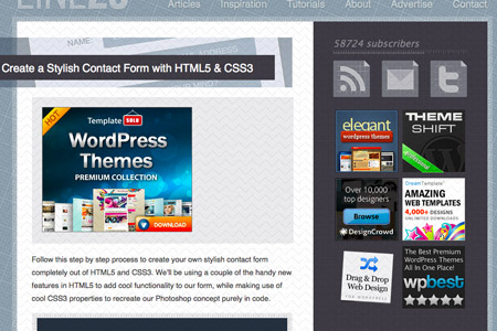
As I’m sure most of you who have visited my blogs before know, I write design tutorials that describe the process of building certain types of designs or how to recreate particular effects. These tutorials are commonly for Adobe Illustrator, Adobe Photoshop or HTML/CSS web design topics.
Why people hate me for this
It has been mentioned by a good selection of people in the design industry that design tutorials are ruining the community, creating nothing more than an army of zombie designers who are coming into the industry with no skills except being able to follow a step by step guide to create ‘cookie-cutter’ styles and effects.
Why people love me for this
Many designers, including myself have used design tutorials as an insanely valuable resource for getting to grips with the design software we’re required to use in this industry. Students and veteran designers alike have used my tutorials to boost their knowledge and develop their skills in Illustrator, Photoshop and in general web design. They’ve learnt new tips and techniques that they’ve then been able to put into practice in their subsequent design projects.
Why I keep doing it
I receive awesome emails every day from people thanking me for sharing my design knowledge through tutorials. Many have stated that my tutorials have seen them through college/university and a few teachers and lecturers have even explained how their classes have been based on my tutorials. I always post out my guides to explain processes so designers can put these techniques into effect in their own projects. The large majority of designers take the foundations from my tutorials and build on them using their own knowledge. This doesn’t sound like an army of zombie designers at all in my opinion.

List posts is the term that has been given to posts on design blogs that do nothing more than showcase a number of designs purely for visual interest or inspiration. List posts don’t provide any knowledge, facts or opinions but they’re the amongst the most trafficked type of post.
Why people hate me for this
Due to their success in bringing in huge traffic list posts have become over-used to the point where some list posts don’t even have a specific focus on what they are showcasing. Now, list posts and the blogs that post them are seen to be ruining the community by saturating it with content that has no intellectual value.
Why people love me for this
List posts are amongst the most highest trafficked and best performing posts a blog can post. Many people enjoy them because they’re easy to digest and provide useful visual inspiration that can help generate ideas for a designer’s upcoming projects. The list posts I create are usually roundups of resources or a showcase of designs all created with a particular style – All of them are well received by a large portion of my readers and subsequently receive the most traffic, social votes and comments.
Why I keep doing it
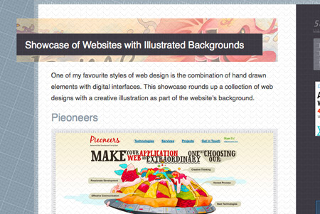
List posts don’t particularly take a lot of effort to produce, when compared to design tutorials and thoughtful articles, yet they always receive almost double the attention. I use the roundups and showcases to quickly put together posts when I’m short on time, or to give my blog a boost in traffic if stats are running low. Most importantly I enjoy creating list posts to discover new resources or design trends I can play around with myself, and furthermore share these things with my readers. In my opinion other types of articles are important to develop a blog in the long term, but I’ll always produce the odd list post as long as they receive the traffic, social votes and exposure they do today.

Attention grabbing titles aren’t anything new to the blogging world. They’re used extensively in the real world in everything from newspapers to advertising and marketing. A catchy title will usually ‘big up’ its content using exciting adjectives between the key words in the heading.
Why people hate me for this
Some people feel cheated if they follow a link that doesn’t turn out to be as interesting as the title suggested. In some of my titles I’ve been criticised of using the word ‘awesome’, because that particular person only deemed the design worthy of ‘cool’ (true story!). Some of my post titles have provided high expectations as to what the viewer will see, which has resulted in disappointment in the past.
Why people love me for this
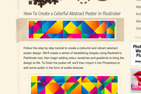
In most cases people have followed a link from social websites such as Twitter because the title sounded interesting and have subsequently enjoyed my content. Those people may have missed out if the title used simple or plain wording to describe the post. ‘How To Create a Colorful Abstract Design in Illustrator’ will always perform better than ‘How To Create a Design in Illustrator’.
Why I keep doing it
As long as newspapers and advertising companies use intriguing headlines in their content, I’ll continue to use vibrant adjectives or metaphors in my titles to inject excitement into my posts. People click on interesting, exciting or thought provoking titles while plain or boring wording simply passes them by.

Every week I post a new article and tweet out links to my followers on Twitter. Due to the differences in time zones and the general working of Twitter I post the same link multiple times throughout the week in the morning, afternoon and evenings on different days.
Why people hate me for this
People hate being spammed. Unfortunately some of my repeated tweets catch a select number of people multiple times throughout their day or week. This can be annoying, particularly for those who don’t follow many people as the same link from the same person can quickly fill the whole Twitter stream on third party apps.
Why people love me for this
For every person who is unfortunate enough to be online to see a repeated tweet the second, third and even fourth time throughout a given week there is always a larger proportion of people who are seeing it for the first time. These people would have otherwise missed out on the news. Even on the fourth time a link is posted it receives just as many favourites and retweets.
Why I keep doing it
The obvious reason I keep retweeting is to squeeze out as much attention on my posts as possible as I only post one main topic per week, unlike other blogs who post every day. I’m forever aiming to get feedback from people who are getting annoyed from seeing my tweets multiple times and have recently decreased the number of times I re-post. However I’ll always schedule up multiple tweets in order to catch people across different time zones.

Every now and again I’ll run through my RSS feed and tweet out links to the design articles I found interesting. A year or two ago I posted a link every 15 minutes, nowadays I’ve had to decrease it to one tweet per hour or less.
Why people hate me for this
Even if the content I’m tweeting isn’t my own, if my tweets are too closely timed in that they fill the stream of users who don’t follow many people it quickly becomes annoying. It doesn’t take long for people to label you as a spammer.
Why people love me for this
I’ve managed to build a following of over 40,000 people on Twitter primarily from tweeting useful design links. This has always added value to my profile in that designers receive tips of interesting articles and tutorials as well as general life updates and conversational tweets.
Why I keep doing it
The large majority of my followers enjoy receiving design links, but I’m always aiming to spread out these links in order to avoid ‘spamming’ those who don’t have an active Twitter stream. At the moment I post one design link per hour after picking out topics from my RSS feeds. I’ll stick to this frequency until more complaints are sent my way.

Over the past four years my blogs have reached a level in terms of visitors, subscribers and search engine rankings that it has become lucrative to earn revenue from selling advertising space. Currently I have a series of 125px ads in the sidebar, and a larger ad above the content on older posts.
Why people hate me for this
Earning money for doing something that isn’t considered ‘hard work’ or ‘skillful’ can often be frowned upon. To some earning money from writing blog posts, tutorials and articles isn’t something you should be doing. The ads on my websites to some people cause too much of a distraction or don’t fit in with their ethical views.
Why people love me for this
Some people find my content hugely beneficial to them and enjoy seeing revenue being generated in return. I’ve also heard from many who have found the story of my blog and how it has changed my life inspirational and has given them the drive to earn money from doing something they love.
Why I keep doing it
Ever since I first introduced an ad spot on my blogs I’ve always aimed to keep them non-intrusive. There are plenty of advertising opportunities I don’t make use of, many of which can be seen on larger design blogs. Earning passive income and more so a living from a website is something everyone wishes for, so it’s a dream come true that I have the opportunity to do so.

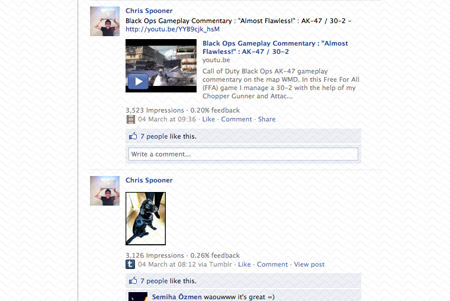
On my Twitter and Facebook accounts I’ll often post out photos of my dog, general life updates or gameplays from my Black Ops gaming hobby. Generally people follow me because they have an interest in my personally, others only want to receive updates based on the topic of design.
Why people hate me for this
Many people know of me and follow me on social websites for design related knowledge, updates and links. Dog photos, general updates, what music I’m listening to and gaming links aren’t something they want to know about. Anything other than design content can quickly result in the ‘spamming’ of their accounts.
Why people love me for this
It’s awesome that I’ve made so many friends and contact via Twitter and other social networking sites who have an interest in me personally. Most often I’ll find people with similar interests when I post non-design related content and in most cases I find it helps develop these friendships and bonds beyond my blogs.
Why I keep doing it
I’ve always built my blogs and profiles around myself as a person, rather than a company, so general life updates and tweets based on my hobbies and interests will continue. Design is obviously my largest passion so that kind of content will be in the majority but there will always be dog photos and gaming links. Setting up multiple profiles to post different content simply isn’t practical, nor would those updates go out to the people who would otherwise enjoy them.
So basically what I wanted to point out is that no matter what you do there will always be a selection of people who disagree with what you’re doing. The question is how much notice should you take? If you were to try to please everyone, no one would be happy. I personally try to balance things in order to keep as many people happy as possible, but I’ll always look at the bigger picture and try to figure out what the general consensus is.
It’s also worth noting that usually positive feedback will be much more scarce than negative feedback, but you can often discover how people feel by checking behind the scenes at statistics and trends.
Let’s take list posts for example. You don’t need to look far to see how hated they are by a fairly large portion of people. There’s tweets and blog posts describing how terrible they are so it would be easy to assume they’re worthless. But looking at the traffic statistics and seeing how much more popular these posts are than thought-provoking articles and tutorials just goes to show the larger majority of the audience, although they don’t vocally express their opinion, do actually enjoy them.
So to finish off I thought it would be fun to ask for your opinions in terms of what I do online. What do you love/hate about me? What would you change? And what are your thoughts about balancing between negative and positive feedback?
Hopefully this doesn’t end up with me sobbing in the corner ;-)


