lundi 27 juin 2011

Blog.SpoonGraphics | Latest Blog Entry

Blog.SpoonGraphics | Latest Blog Entry


How To Create an Abstract Geometric Mosaic Text Effect

Posted: 26 Jun 2011 11:00 PM PDT

I recently stumbled across the new branding for the Canadian Olympic Team, which then reminded me of my recent abstract geometric poster design tutorials, so I decided to combine my technique with the idea of creating a patriotic design with a similar mosaic effect. Following this step by step Illustrator tutorial to create a colourful abstract text effect made up of lots of tessellating mosaic elements.

Great Britain text effect design

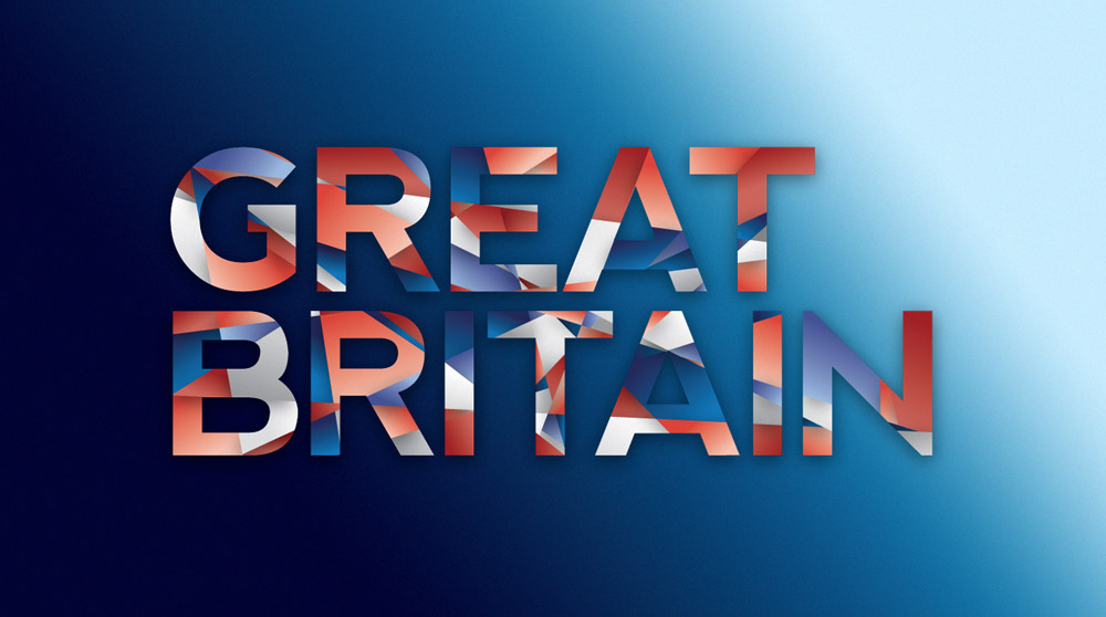
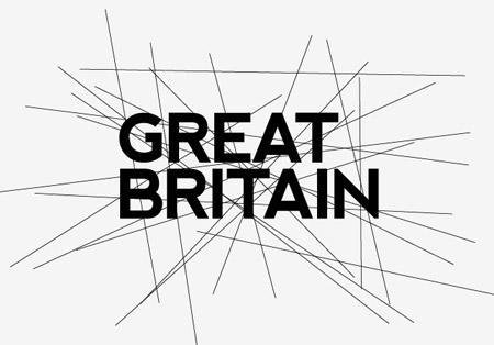
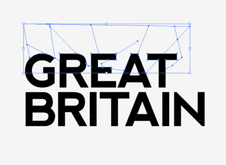
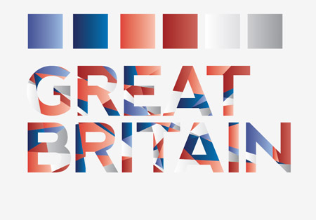
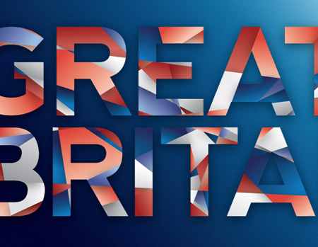
The original design that spurred this idea was based on the country of Canada, so for my own design I’ll base it on the text Great Britain. The dividing lines across the text follow the crude angles of the Union Jack design and two shades of each colour are used to add a range of tone.

View the full size text effect design

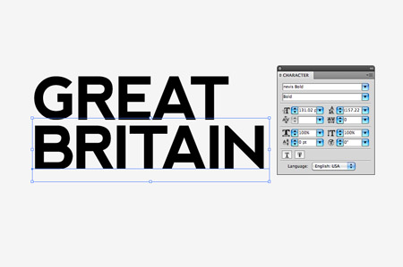
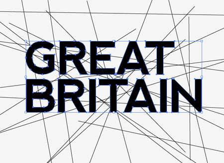
Open up Adobe Illustrator and type out the wording of your choice. Here I’m using the free yet pretty cool Nevis font.

Select the Line tool and begin drawing intersecting lines across the text. The Union Jack’s angles all cross in the centre, but for The Stars and Stripes you might want to use more horizontal lines with minimal vertical lines. Otherwise, if you’re creating a generic design, just go mad!

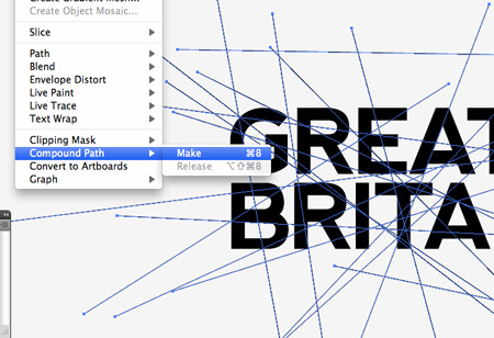
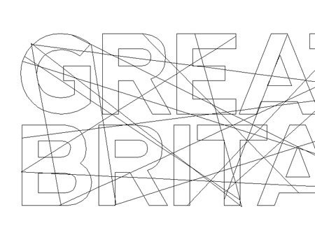
Select both text elements and convert them to outlines by pressing CMD+Shift+O. Then create a Compound Path using the shortcut CMD+8.

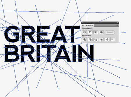
Draw a selection over the whole design, shift-click the words to remove them from the selection then make a Compound Path of all the lines.

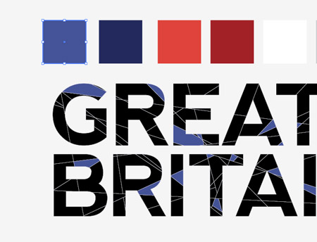
Select both the lines and the text then click the Intersect option from the Pathfinder palette. This will make cuts through the text wherever a lines passes over it.

Right click and select Ungroup, then select and delete the excess linework from around the eges of the wording.

Toggle on Outline Mode (CMD+Y) to see the otherwise invisible linework that is still present between each letter. Go through and delete anything outside of the letter outlines.

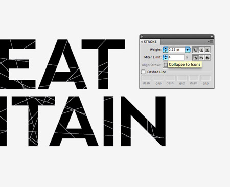
Give everything a thin 0.25pt white stroke to make each individual mosaic shape visible. If there are any really tiny shapes, merge them with their neighbours using the Pathfinder tool to create larger objects.

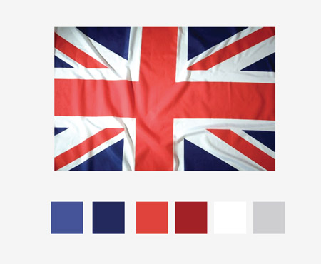
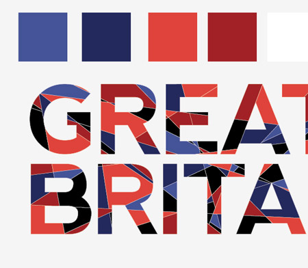
Use the colour picker to select light and dark tones of each colour in the flag. Here I’m using a photograph of the Union Jack.

Randomly select shapes across the design while holding the Shift key then replace their fills using the Eyedropper tool on the first colour swatch.

Continue the process with each colour in the palette, selecting random shapes from the mosaic until the majority of the design has a blue, red or white fill.

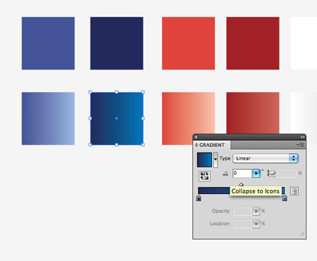
The flat colours look a little… flat, so make a duplicate and use the base colour to create gradients flowing to a lighter tone.

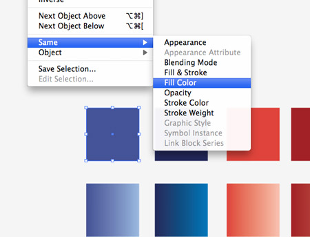
Select the first flat colour swatch then go to Select > Same > Fill Colour. Click the new gradient swatch with the Eyedropper tool to replace all the fills.

Repeat the process of replacing colours until the whole design is made up of gradient fills. The gradients really help bring the design to life with added depth over the flat colours.

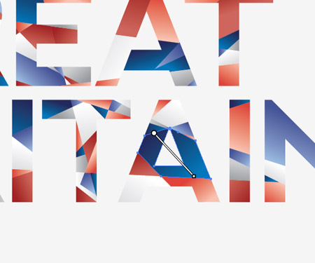
Currently all the gradients are flowing in the same direction, so go through and adjust the angle of each shape with the Gradient tool to add variety to the design.

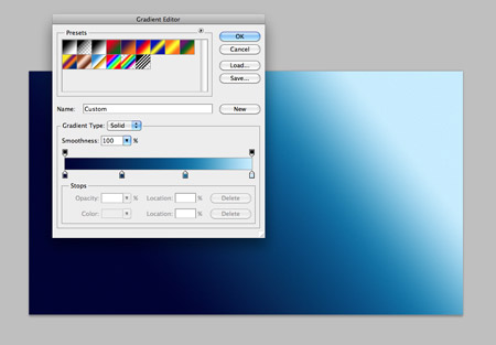
Switch over to Adobe Photoshop to finish off the design. There’s nothing we can’t do in Illustrator, but Photoshop tends to handle effects such as noise and shadows a little better. Fill the background with a cool blue gradient to harmonise with the blues in the text effect.

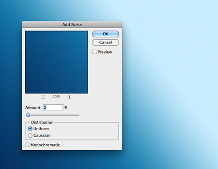
Add a touch of Noise using the Filter > Noise > Add Noise menu option. Just 2% will add enough to create a subtle noise texture.

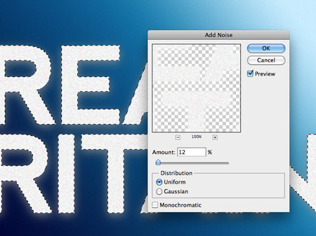
Paste in the text effect design from Adobe Illustrator and give it a subtle Drop Shadow using Photoshop’s layer style effects.

CMD-Click the layer thumbnail of the text to load the selection and fill a new layer with white. Add a Noise filter of around 12% to this layer.

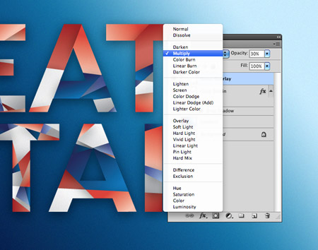
Change the blending mode of the noise layer to Multiply to render the white area transparent, then reduce the opacity until the noise provides a subtle texture to the text.

Great Britain text effect design

This finishes off our abstract geometric mosaic style text effect. The intersecting lines really makes for a cool looking design while the colours and gradients help lift the text from the screen.

Download the source file

vendredi 24 juin 2011

Blog.SpoonGraphics | Latest Blog Entry

Blog.SpoonGraphics | Latest Blog Entry


How To Get More Traffic To Your Website (and more!)

Posted: 23 Jun 2011 11:00 PM PDT

In this week's question time I talk about how you can drive more traffic to your website using a blog. The theory is quite simple, but keep in mind it can take a long time before the time you’ve invested brings in the opportunities you’ve been waiting for.

This week’s questions

Hi Chris, I started a website and I was wondering if you have any tips on how to increase traffic to the website?

Hey Chris, I have created a design website for myself and I was wondering if there was any way of getting more traffic to it to gain more clients?

Interesting design links

How to create amazing colorful text effect in Photoshop

SEO Beyond Your Site

40 Awesome Illustrator Tutorials

Ask a question

Have a question in mind? Fire it over to me on my Formspring account and I'll drop in my text based answer. Every couple of weeks I'll pull out a hand full of questions to expand on or talk about in more detail in video format.

Ask a question for the next episode

lundi 20 juin 2011

Blog.SpoonGraphics | Latest Blog Entry

Blog.SpoonGraphics | Latest Blog Entry


Create a Cool Vector Robot Character in Illustrator

Posted: 19 Jun 2011 11:00 PM PDT

Looking to learn the basics of Adobe Illustrator? In this tutorial we’ll use various tools and techniques to create a simple vector robot character. With this robot being made of lots of basic shapes it makes for a great tutorial for beginners to get to grips with the Illustrator application.

Vector robot character

Here’s the simple vector cartoon robot character we’ll be making in this tutorial. It’s essentially made up of lots of basic shapes such as rectangles and circles, but we’ll bring it to life with varied stroke weights, gradient fills and subtle highlights.

Open up Adobe Illustrator and create a new document. Select the rectangle tool and draw the basic head shape and an antenna. Switch to the circle tool and add shapes to either end of the antenna. Press CMD+Shift+[ with the lower circle selected to send it underneath the rectangle.

Draw a circle to form an eye, then go to Object > Path > Offset Path. Enter 1.5mm in the Offset option field to create a slightly larger circle aligned exactly to the original.

Use a mix of basic shapes such as rectangles, circles and rounded rectangles to finish off the robot head with a range of features. Group pairs of elements like the eyes then align everything up centrally.

Add various buttons and dials to the body of the character with more basic shapes, keeping everything centered with the head.

Draw the basic outline of the hand with a large circle. Copy (CMD+C) and Paste in Front (CMD+F), then hold ALT and Shift while scaling the new circle down.

With both objects selected use the Subtract option from the Pathfinder pallete to punch out the smaller circle from the larger circle.

Draw a square, rotate it by 45 degrees then position it centrally over the circular ring. Toggle on Smart guides to make the alignment easy (CMD+U). Use the Pathfinder once again to punch out this square selection.

Select all the shapes that make up an arm, copy and paste in front. Go to Object > Transform > Reflect and select the Vertical option to flip the objects, then position them on the opposite side.

Even though we’ve only used standard tools with just a couple of custom shapes our robot is starting to look pretty cool!

Grab the Polygon tool and click and drag a shape onto the artboard. Before releasing the mouse increase or decrease the number of points to 5 with the keyboard cursor keys.

Align this pentagon exactly with the lower corners of the body rectangle. Toggle on Outline mode (CMD+Y) for a clear and precise view.

Draw a diagonal line running parallel to the lower half of the body with the line tool. Copy/Paste and flip the line and position the duplicate on the opposite side.

With both lines selected go to Object > Blend Make, then head back to Object > Blend > Blend Options. Change the Spacing to Specified Steps then alter the number to suit.

Finish off the robot with a couple more rectangles and heptagons as legs and feet, then clip off the bottom of the feet with a temporary rectangle along with the Pathfinder tool.

Draw a selection around all the shapes that make up the robot, copy and paste in front then click the Merge option from the pathfinder palette. Clear out the fill and bump up the stroke to 5pt aligned to the outside.

Go through each individual element and adjust the stroke weight according to its prominence in defining the profile of the character. Use 3pt for important objects like the head, 2pt for no-so-important elements and 1pt for the finer details.

Now we can begin to add some colour. Give each shape a colour fill. I’m using two tones of grey for the body parts, red for key areas and blue or yellow for buttons and dials.

To add a little more depth to the otherwise flat design, we can switch out the solid fills with cool gradients. Create swatches for each of your colour selections with a light-dark gradient tone and replace the fills. Adjust the angle of the gradients where necessary with the Gradient tool.

We can also add more depth by creating a series of subtle highlights. Copy and paste a duplicate of the antenna and fill it with white. Draw a temporary shape that cuts through the circle then clip out the shape with the Pathfinder palette.

Change the opacity of this clipped shape to around 20% to create a soft reflection which gives the impression of a shiny or glossy material.

Repeat the process for each shape across the robot’s body to add subtle light reflections to add more depth and a touch of realism to the design.

Finish off the design with a little shadow. Begin with a circle filled with a soft grey to transparent gradient.

Squash the shape down and position it under the robot’s feet. Use the shortcut CMD+Shift+[ to send the shadow to the bottom of the stack.

Vector robot character

This leaves our cool retro style vector robot character complete. Even though it’s made from basic shapes and simple colour fills those varied line weights, gradients and highlights really help bring it to life and lift the character from the screen.

Download the source file