vendredi 29 avril 2011

Blog.SpoonGraphics | Latest Blog Entry

Blog.SpoonGraphics | Latest Blog Entry


Is There Enough Room for New Designers? (and more!)

Posted: 28 Apr 2011 11:00 PM PDT

In this week's question time I talk about how you can find new clients on the Internet; what the best application is for designing logos; whether I’m right or left handed; if there’s still room for new designers in this saturated industry; and why I don’t make video tutorials.

This week’s questions

  • I am finding it hard getting myself out there too the local public. I’ve tried finding clients via the internet but it is far too competitive. How can I help myself?
  • What would be the best program for logo design? Illustrator vs Photoshop or others?
  • Hey Chris! I always wondered if you were left or right handed?
  • Would you say there’s room for new graphic designers in the business? With the vast amount of designers out there, I do worry that maybe there isn’t ‘room’ to get noticed anymore. What is your opinion?
  • Hey yo! I like all your art work and tutorials. It is so cool man, can you make video tutorials? PLZZZZ

Interesting links

How To Create a Print Ready Cafe Menu

Create a Burning, Vector Match Using Gradient Meshes

Design a Print-Ready Retro Business Card

Ask a question for the next episode

lundi 25 avril 2011

Blog.SpoonGraphics | Latest Blog Entry

Blog.SpoonGraphics | Latest Blog Entry


How To Create a Retro Badge/Emblem Style Logo

Posted: 24 Apr 2011 11:00 PM PDT

The retro style badge/emblem of logos is a hot trend at the moment, and it’s no surprise why – They’re super cool! We’ve already looked at a showcase of retro and vintage style logos based on circular motifs, now let’s build our own. We’ll put the basic structure together in Illustrator, then give it that aged vintage appearance with some finishing touches in Photoshop.

Retro badge logo

The logo we’ll be creating is for the totally fictional Powerhouse Gym (although I wouldn’t be surprised if there was a gym somewhere with this name!). It combines many of the typical traits of this retro/vintage theme with alternating rings of black and white as well as fine details such as the stars and dots. The text and tagline follow the circumference of the circle while the icon sits bang in the centre and gives visual feedback as to what the logo is promoting.

View the retro/vintage logo design

Be sure to check out the showcase of retro badge/emblem logos, then when you have plenty of ideas open up Adobe Illustrator and create a large circle. Copy (CMD+C) and Paste in Front (CMD+F) a duplicate, scale it down slightly while holding ALT and Shift, then switch the fill for a white stroke.

Press CMD+F to paste in another duplicate, scale down and change the fill to white. Paste in another, scale it down a little further to give the impression of a thick ring.

Paste a couple more circles and scale them appropriately to add a couple of thin strokes on the inside and outside of the white ring.

Position another circle exactly in the centre of the white ring, then adjust the stroke settings to 4pt Weight, Round Cap, Bevel Join, Dashed Line, 0pt Dash and 17pt Gap. For the gap setting in particular, use the cursor keys to nudge the number up and down until the circles are spaced evenly.

Elsewhere on the artboard, draw a series of weight plates with the rounded rectangle tool. Scale and position each larger plate with the same distance between them.

Use the rectangle tool to add a handle, then copy, paste and rotate the series of plates to finish off a simple dumbbell icon.

Switch the fill of all the shapes that make up the dumbbell to white, group them together and position the graphic in the centre of the logo.

Copy and paste one of the circles from the logo and clear out the fill and stroke. In the Text tool menu select the Type on Path option and click on the circle.

Enter the words Powerhouse Gym then select an appropriate font. Slab-Serif fonts typically have a strong and masculine feel, so I’ve picked out Boton for use in this logo.

Instead of adjusting the tracking of the letters, go to Type > Type on a Path > Type on a Path Options and adjust the spacing here. This setting will generate more even gaps where the tracking would bunch letters together as they flow around the curve.

Use the Direct Selection Tool to carefully adjust the little handle to centre up the text. Use a guide to make sure the wording starts and ends at the same angle.

Copy and Paste the circular text shape and replace the wording with the tagline ‘Reach your potential’. Use the little handle to adjust the text to sit on the outside of the circle and towards the bottom of the logo.

In the Type on a Path settings, adjust the Align to Path option to Ascender, then make another subtle tweaks to the size to make sure the text fits perfectly to the centre of the black ring.

A couple of stars finish off the text by separating the two sets of words. Scale and position one into place, copy and paste in front a duplicate and move this duplicate horizontally while holding Shift.

The vector version of our logo is complete. Illustrator’s tools made it easy to create the overall structure while keeping everything scalable and editable.

Let’s finish off the logo with some cool textures in Photoshop. We could import a texture, live trace and punch out some distressed marks with the Pathfinder, but you just don’t get the same effect as real textures in Photoshop.

Paste in the logo from Illustrator into a temporary Photoshop document and scale into place.

Use the super handy Subtle Grunge brushes from WeFunction to add grungy spots of white on a layer above the logo.

CMD+Click the logo layer’s thumbnail, press CMD+Shift+I to invert the selection and delete out the excess.

Retro badge logo

Tune the grungy effect by adjusting the opacity of the layer. This simple touch gives the logo that old, worn and distressed appearance of a genuine badge, sticker or emblem.

Download the source file

mercredi 20 avril 2011

Blog.SpoonGraphics | Latest Blog Entry

Blog.SpoonGraphics | Latest Blog Entry


MOJO-Themes Bundle Giveaway for Premium Members

Posted: 19 Apr 2011 02:21 AM PDT

The friendly folks from MOJO-Themes are currently celebrating their one year anniversary, and have arranged a giveaway of 3 of their Anniversary Bundles to Access All Areas members. The bundle includes 14 of their most popular WordPress and Tumblr themes, with a total value of $442. Members, log in to ...

Log in to your Access All Areas account to read the rest of this post.

Not a member? Becoming an Access All Areas member gives you the ability to view exclusive members-only content just like this. The premium category is already packed full of discount codes and useful design resources, and there's plenty more to come! Find out more about becoming a member, or take a peek at what's available to premium members so far.

lundi 18 avril 2011

Blog.SpoonGraphics | Latest Blog Entry

Blog.SpoonGraphics | Latest Blog Entry


How To Create a Dramatic Action Scene in Photoshop

Posted: 17 Apr 2011 11:00 PM PDT

I’ve recently been admiring the book covers of those military action thrillers, you know – Andy McNab and the like? So I decided to have a go at designing my own dramatic war torn scene in a similar style. Follow this step by step photo manipulation tutorial where we’ll be using stock photos, textures and brushes to produce an intense design.

Fight for your Freedom design

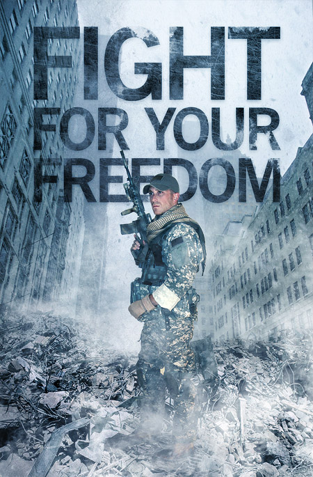
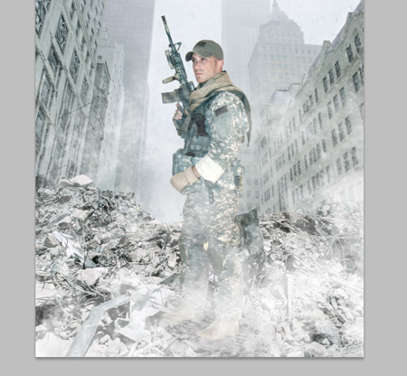
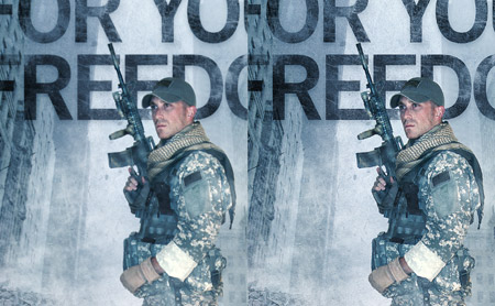
The design I’ve put together features a soldier standing in the streets of war torn Manhatten. The title ‘Fight for your Freedom’ gives an insight into the topic of this fictional book’s storyline. Overall I’ve given it a grungy feel with cold tones and lots of harsh textures.

View the full size action scene design

Stock photos used in the design

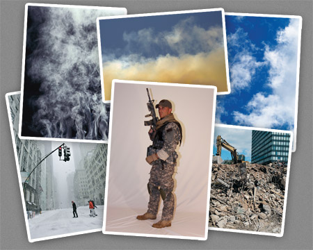
Being a photo manipulation piece, the first step is to source a bunch of stock photographs. I used the free library from DeviantArt for the cool soldier image, the free SXC.hu collection for most of the clouds and the thorough ThinkStockPhotos library for everything else.

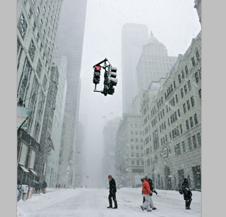
The main background is made up of a Manhatten street. This snowy scene is perfect for the cold feel of the design we’re building as the mist and snow flakes will help give the impression of smoky ruins. We don’t really want the traffic lights in the centre of the shot, so use the Clone tool to begin erasing out the supporting pole.

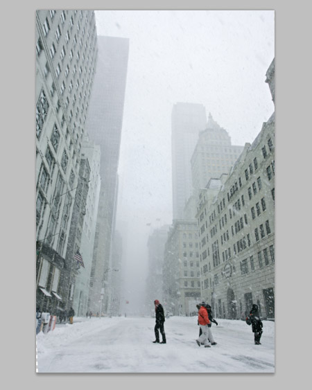
Copy a section from the snowy sky and paste it over the traffic light. Adjust the Levels to match the tones then erase the edges with a soft brush to blend the patch with the original photo.

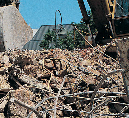
Switch over to the photo of a demolition site and begin tracing the outline of the pile of rubble with the Pen tool. The outline doesn’t need to be too accurate as we’ll blend and merge the image later.

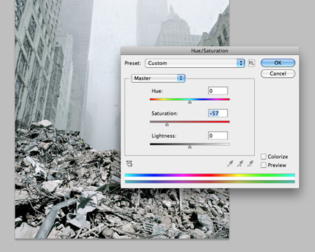
Use the Hue/Saturation adjustment tool to alter the tones of the rubble to match the tones of the background. A large amount of desaturation will soon bring the two to a close match.

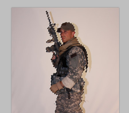
Save and open a soldier photo from DeviantArt user Nemesis-19. Carefully trace the outline with the Pen tool, then right click and Make Selection. Copy and paste this selection into the main document.

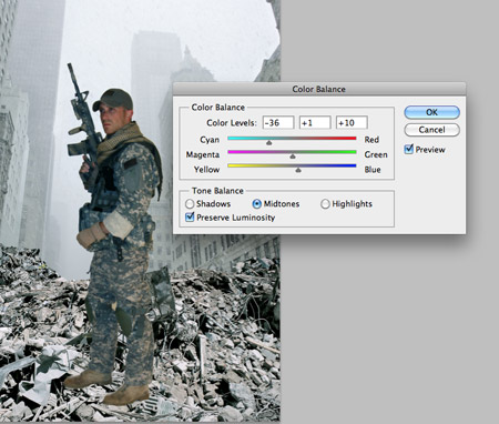
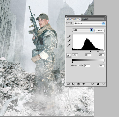
The indoor lighting on the solider doesn’t match the tones of the document, so open up the Color Balance window (CMD+B) and adjust the sliders for the Shadows, Midtones and Highlights. A large amount of cyan and blue will begin to correct the colours.

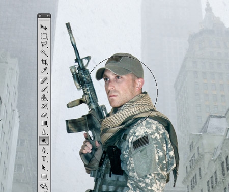
Open up the Levels adjustment window and clip the highlights to brighten up the image, then use the Dodge tool to lighten up areas of the solider such as the face even further.

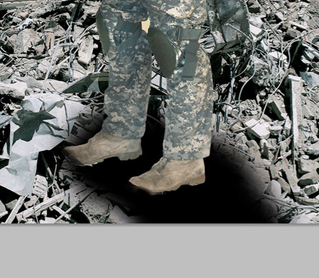
Add a layer mask to the solider and erase out portions of the boots to give the impression he’s stood within the pile of rubble, then paint some black areas on a new layer to act as shadows. Change the blending mode of the shadow layers to Soft Light and Multiply.

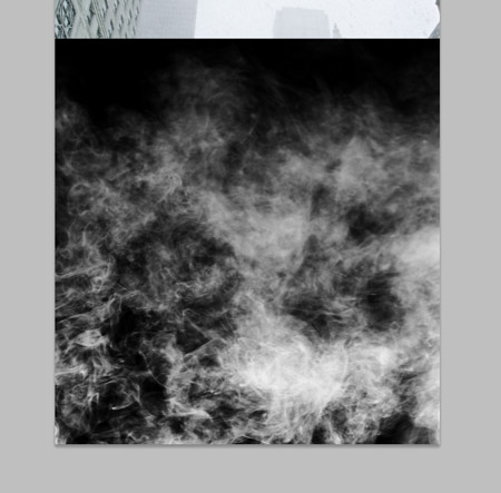
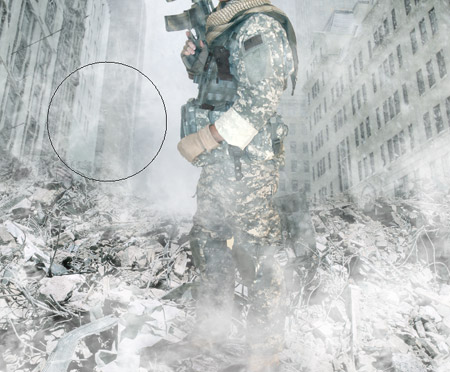
Paste in an image of smoke. Adjust the Levels to darken the blacks, then change the blending mode to Screen. The screen blending mode will turn the black areas transparent.

Paste in a couple more duplicates of the smoke image, each with a different position. As the smoke/mist build up it disguises the feet and helps them blend more naturally.

The tones of the legs are a little too light compared to the background, so add a Levels Adjustment layer to really darken down the image. Use the layer mask on the adjustment layer to limit the levels effect to just the feet and lower legs.

Add a layer mask to the rubble layer and use a soft brush to subtly erase out the hard edge. This will help it blend with the mist and fade into the background.

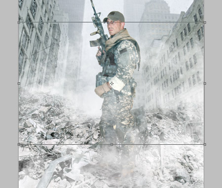
Paste in an image of clouds, desaturate and darken the levels. Change this layer to Screen, then position it under the rubble layer to give the impression of smoke/mist rising from the rubble surface.

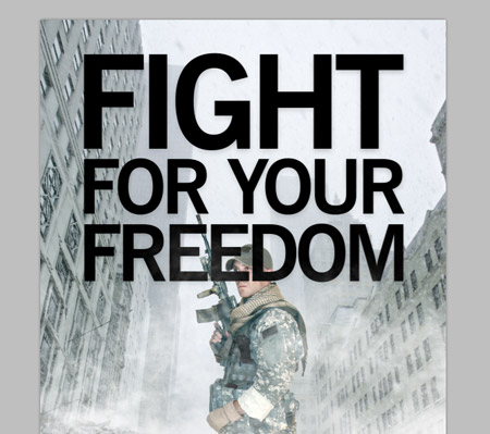
Add a title of your choice to the design. Here I’ve adjusted the words Fight For Your Freedom to fit within the same width.

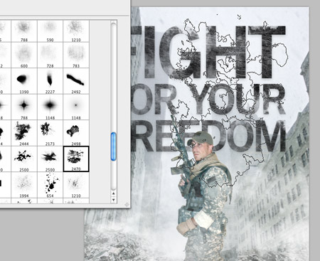
Add a layer mask to the text layer and begin roughing it up with a range of Photoshop brushes. Two sets I used were the subtle grunge brushes from WeFunction and the Ink Stains pack from WeGraphics (Available to Access All Areas members!).

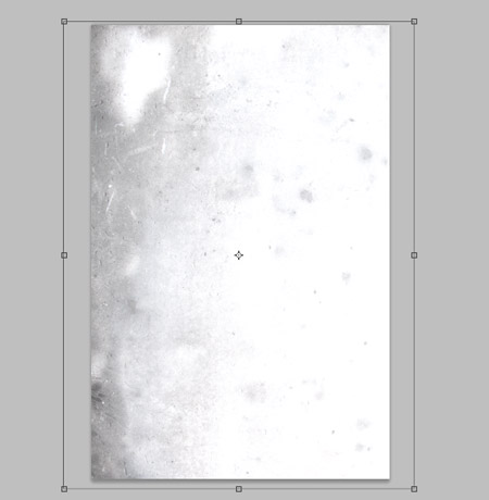
Paste in a grungy texture, like this one from LostandTaken and adjust the Levels to create more contrast. Set the blending mode of this texture layer to Linear Burn at 50%.

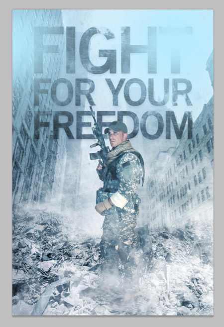
Fill a new layer with solid blue (#43586e) then set this layer to Overlay. This will give the design a cold and eerie blue colour cast to add to the dramatic theme. Add a couple of light blue splodges set to Soft Light to add some variation in colour and tone.

Paint a few splodges of black across the design to darken random areas to add variation in tone. Set this layer to Soft Light at 60%.

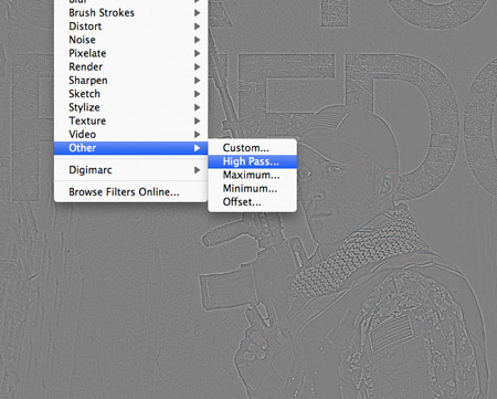
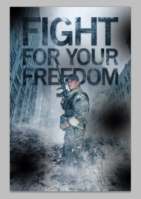
When you’ve finished adjusting the colours and tones of the image, press CMD+A to select all, then CMD+Shift+C to Copy Merged. Paste the copy at the top of the layer stack and go to Filter > Other > High Pass. Adjust the slider until the details of the design are barely visible from the grey background.

Set this high pass layer to Linear Light and reduce the opacity to suit. When comparing the two it’s easy to see how the high pass really sharpens up the design. Leaving the opacity fairly high will give the design that harsh feeling.

Fight for your Freedom design

The final image is now complete. The basic collation of the various stock photos provides the basic structure to the design, but it really starts to come to life when the colour casts and different tones are added. The cold blues and harsh textures are really what give the design that dramatic war torn feel.

Download the source file