lundi 30 mai 2011

Blog.SpoonGraphics | Latest Blog Entry

Blog.SpoonGraphics | Latest Blog Entry


How To Create a Cool Abstract Radial Pattern Design

Posted: 29 May 2011 11:00 PM PDT

Whenever I’m stuck for tutorial ideas I always seem to be able to fall back on my typical ‘Chris Spooner’ style of cool abstract patterns people seem to enjoy. We’ve used similar techniques on the 3 poster a couple of years ago and more recently on a colourful abstract poster. Follow this latest step by step guide to create a cool abstract design complete with radial pattern and alternating colours.

View the abstract radial design

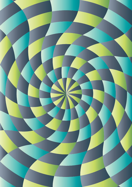
The design we’ll be creating this time makes use of a radial pattern that draws in the viewer to the centre. Alternating colours give the design a cool and funky feel and textures add a touch of authenticity to the artwork.

Create a new document in Adobe Illustrator at the dimensions of your preference and draw a rectangle across the whole artboard.

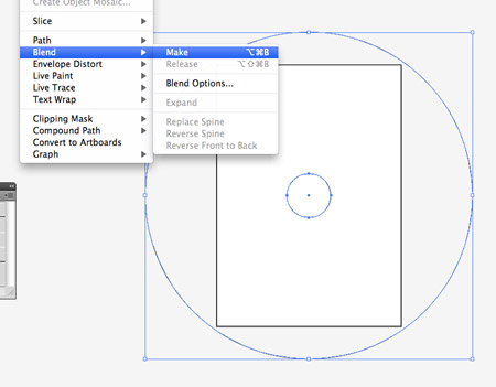
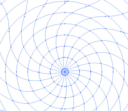
Toggle on Smart Guides (CMD+U) and draw a small circle from the centre of the rectangle. Copy and paste this circle and scale it larger than the artboard itself. With both selected go to Object > Blend > Make.

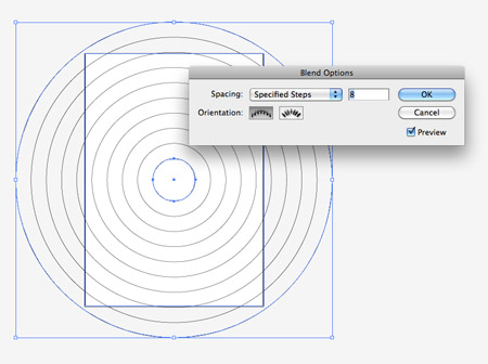
Go back to Object > Blend > Blend Options and adjust the settings to Specified Steps with a count of 8.

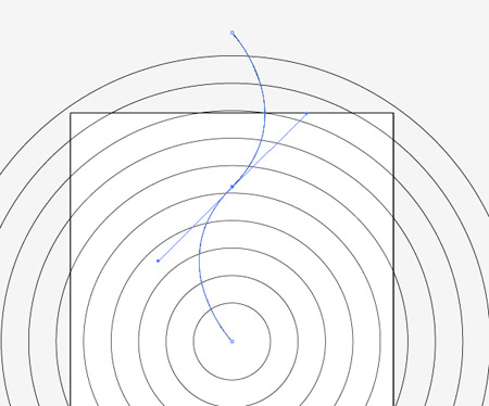
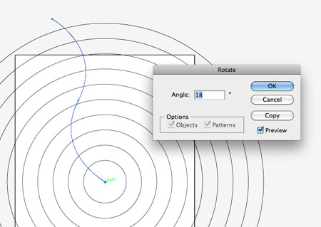
Draw a line from the centre of the document, then with the Pen tool add a point at the halfway point. Use the Convert Anchor Point tool to drag bezier handles from the point to give a smooth curve.

Select the Rotate tool and ALT-click a pivot point in the centre of the document. In the options box enter 18 degrees and press the Copy button.

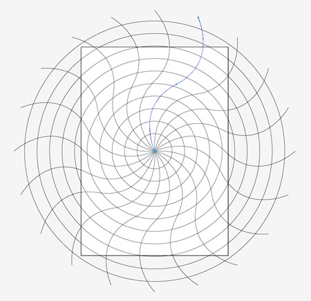
Repeatedly press the shortcut CMD+D to repeat the transformation until you have a series of 20 lines spaced evenly around the circle.

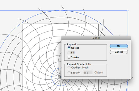
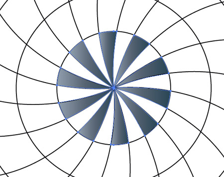
Select the concentric circles and go to Object > Expand. Select the Object checkbox to convert this blend into editable paths.

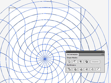
Draw a selection across all objects, then Shift-click the background rectangle to deselect it. Create a Compound Path (CMD+8) then with both the compound path and background rectangle selected, click the Divide option from the Pathfinder palette.

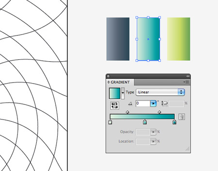
Right click and Ungroup, then delete out the excess linework beyond the edges of the artboard. Elsewhere on the document set up some gradient colour swatches for use in your design. Here I’m using grey, blue and green each with changes in tone from light to dark.

Hold Shift while selecting alternating shapes in the inner portion of the radial pattern. Give these shapes the grey gradient fill with the eyedropper tool.

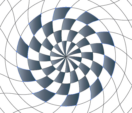
On the next and subsequent rows select alternating shapes to create a chequerboard style pattern. Continue until you’ve filled the whole design.

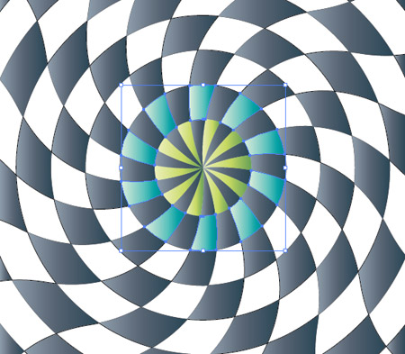
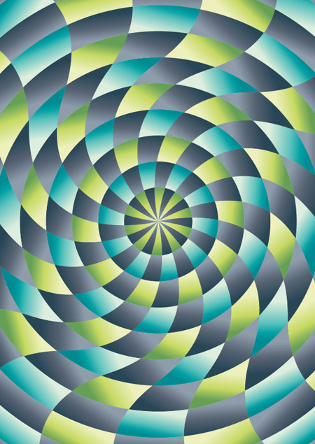
Use the green gradient to fill the leftover shapes in the centre area of the pattern, then switch to blue for the next row.

Alternate between blue and green fills until the whole design is filled with gradient colours.

Currently all the gradients are flowing in the same direction. Manually select each shape in turn and adjust the gradient angle with the Gradient tool.

After a lot of clicking and dragging all the gradients will follow the same radial path, which gives the design a much more dynamic feeling.

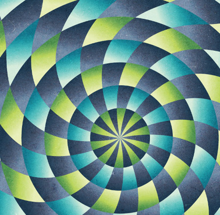
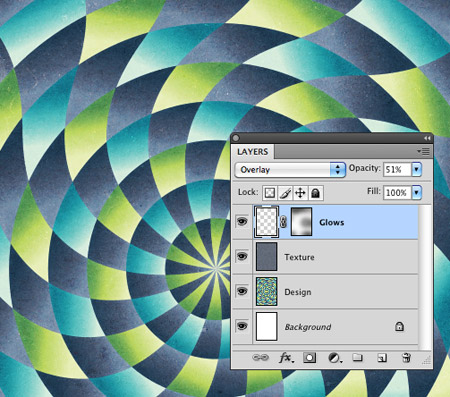
The vector work is complete, but let’s switch over to Photoshop to give the design a more tactile feel. Paste the design into a large PSD, then import a cool grunge texture.

Change the blending mode of the texture to Overlay to allow the texture and colours to interact with the vector pattern.

Switch back to Illustrator and clear out the fills from all the objects, then add a white stroke. Copy and paste this graphic into the Photoshop document.

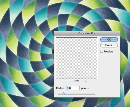
Go to Filter > Blur > Gaussian Blur and enter around 3px to take the harsh edge off the white strokes.

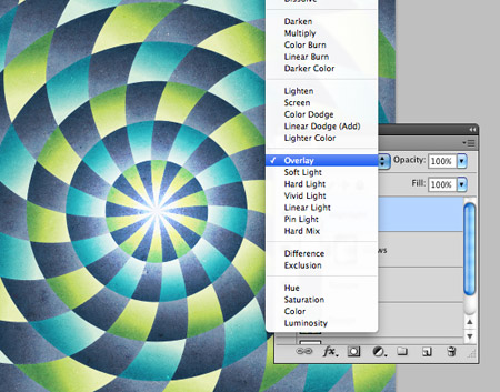
Change the blending mode to Overlay at 50%, then dab a few spots of black with a large soft brush on a layer mask to adjust the impact of these glowing lines.

Add a soft spot of white in the centre of the design and change the blending mode to Overlay to finish off the design with a vibrant highlight.

View the abstract radial design

Our cool abstract radial pattern design is complete and ready for printing as a large format poster. The Photoshop steps really transform the lifeless and flat vectors into a tactile and authentic feeling design while the radial pattern draws you into the centre.

Download the source file

vendredi 27 mai 2011

Blog.SpoonGraphics | Latest Blog Entry

Blog.SpoonGraphics | Latest Blog Entry


What to do if a Client Hates Your Design (and more!)

Posted: 26 May 2011 11:00 PM PDT

In this week's question time I talk about what you can do if your client dislikes your design work, what you can try to avoid back pain while working at your computer and whether it’s a good idea to label yourself as a Freelance Designer.

This week’s questions

Have you ever had a client that didn’t like the designs you submitted or could not grasp why you used a certain design element despite your efforts to explain to them your reasons? And if so, how do you deal with such a situation?

Could you say something clever about work position? I tend to get a back pain and lean in on my 27″ screen, even though it should be big enough (and I don’t need glasses). I am especially interested in work positions when using a Wacom.

When you were doing more client work, did you call yourself a ‘Freelance Designer’? I have heard many different opinions about labelling yourself as a ‘freelancer’, just curious =]

Interesting design links

How To Create a Sleek Grid Based Website Design

Create a Grid Based Web Design in HTML5 & CSS3

Chris Spooner’s Gaming Channel

Ask a question

Have a question in mind? Fire it over to me on my Formspring account and I'll drop in my text based answer. Every couple of weeks I'll pull out a hand full of questions to expand on or talk about in more detail in video format.

Ask a question for the next episode

lundi 23 mai 2011

Blog.SpoonGraphics | Latest Blog Entry

Blog.SpoonGraphics | Latest Blog Entry


How To Create a Sleek Grid Based Website Design

Posted: 22 May 2011 11:00 PM PDT

Want to get your teeth stuck into a website design project to sharpen your skills? Follow this step by step tutorial to create a sleek website design for a fictional eyewear company. In part one of the tutorial we’ll build the Photoshop design concept with a dark colour scheme and lay out the content to a solid underlying grid.

Optik website design

Here’s the complete website we’ll be creating. It’s a sleek design with subtle gradients and eye catching imagery based on an overall dark black/grey colour scheme. The whole website is laid out according to a solid grid which helps balance the page elements.

View the large scale website design concept

Optik logo

The fictional client I’ve made up for this tutorial project is a small eyewear brand named OPTIK. They want a website to showcase their range of products. It needs to reflect the sleek style of their sports eyewear and direct the user to their four product ranges. A selection of photography has been supplied, which needs to prominently showcase the products, otherwise you, the designer has free reign over the overall layout and design. If you’re looking to fill out your design portfolio or if you’re looking for a project to use as practice/experimentation, feel free to use this fictional client as a base for your own designs.

Optik website sketch

The design we’ll be creating as part of this tutorial begins on paper as a sketch along with simple notes. It’s always worth listing out the elements that are required on a page so you can make room and order everything in terms of importance. A simple sketch fleshes out the overall layout and gives us a clear direction when we open up Photoshop.

Create a new document in Photoshop. I have a preset template I use that already contains columns, gutters and a 24px baseline grid. Use the handy generator from http://grid.mindplay.dk to create your own, or if you’re an Access All Areas member, simply download the source file and save it for your upcoming designs.

Fill the background with black, then use the zig-zag pattern from my Line25 pixel patterns freebie to fill a new layer. Inverse the selection, change the mode to Screen and reduce the opacity to 10%.

Draw a selection in the centre of the document measuring the full width of the grid and fill it with black on a new layer.

Open up the layer styles window and alter the Drop Shadow setting to produce a soft grey glow from behind the content panel.

Paste in the OPTIK logo and align it to the grid, spanning three columns and aligning the baseline of the text to the baseline grid. Here I’m using the original vector version, but I’m sure a little magic wand action on the JPEG above will allow you to use the same logo.

Give the logo some cool treatment in the form of a subtle grey gradient and very light Bevel and Emboss effects to give a basic metallic style.

Use the text tool to type out a navigation menu along the same baseline with each item aligning to a column. Set the font styling to uppercase 14pt Helvetica with a light blue fill.

Draw a thin selection across the width of the content panel and fill it with a subtle gradient. Duplicate and flip this gradient and reposition it to outline a feature area at the top of the homepage design.

Paste in the first of the so called product shots, which is actually a stock photo of a cool fellow in some sunglasses courtesy of ThinkStock. Scale the image to size to fit within the feature area.

Draw a selection and create a layer mask to hide the unwanted portions of the image, leaving a letterbox style feature panel.

Use the grid to align some content relating to the feature image. Here the Hydro-tek logo has been imported from Illustrator using the same Eurostile font, while the body text is added in Photoshop as #9d9d9d 16pt Helvetica.

Use the Rounded Rectangle tool to draw the basic shape of a button, then bring it to life with a gradient and fine 1px stroke. Colours have been picked from the image to tie everything together while keeping the basic hue as blue in order to provide a recognisable and consistent colour between all clickable elements and links.

Draw four boxes underneath the feature area aligning their size according to the grid. Fill all four boxes with black.

Open up the layer style window and give the boxes a subtle grey gradient and 1px stroke to define their outline. These four boxes will relate to the four main links of Sun, Sport, Tech and Special.

Import an image that relates to the Sun product range and clip it to size with a layer mask to fit within the little content box. This particular image is another from ThinkStock.

Duplicate the image layer then go to Image > Adjustments > Hue/Saturation. Decrease the saturation by around 60%. We’ll save both layers to create a cool hover effect on the final coded website.

Type out a brief descriptive paragraph that relates to the product range, followed by a call to action link in the usual blue anchor colour.

Finish off these little content boxes with images and content relating to the Sport, Tech and Special sections. More photos from ThinkStock were used alongside a creative commons photo from Flickr by Monsalvador.

Underneath the main content panel use the text tool to lay out some typical footer content such as copyright notice, secondary links and a back to top anchor.

Take a step back and look over the design with the grid on and off. Aligning all the items to the columns and baseline grid helps achieve perfect horizontal and vertical flow, with every page element being neatly aligned.

The final PSD concept is now ready for coding up as a fully working website. If you’re excited to move onto the next step, check out part two over on my web design blog Line25. In the coding part of the tutorial we’ll build the homepage concept in HTML and CSS.

Optik website design

Learn how to create the website in HTML/CSS

Download the source file