Follow this step by step guide to create a sexy vector pin-up girl character design. We’ll start the process with a hand drawn sketch, then draw and manipulate the vector linework in Illustrator before adding colour and shading to bring the character to life.
Meet Kandice, the seductive blonde pin-up girl we’ll be creating as part of this tutorial. The whole design process is split into 3 basic stages; the rough sketch; the linework or ‘inking’; colouring; and finally the shading.
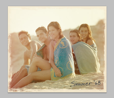
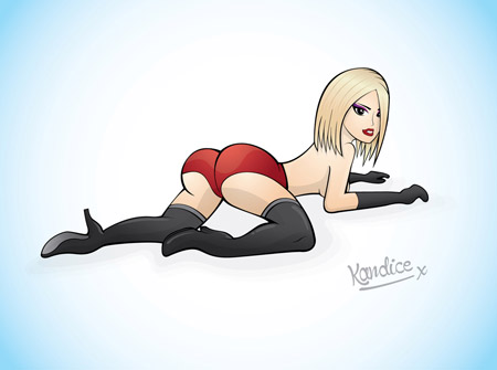
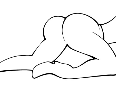
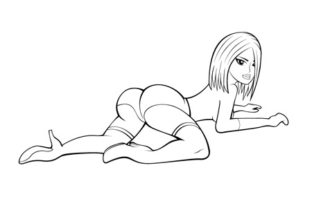
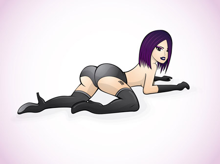
View the final pin-up character illustration
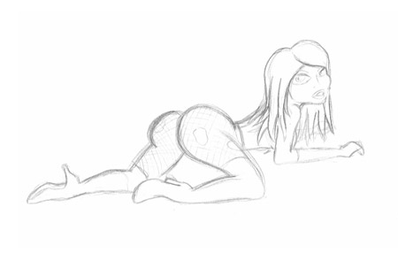
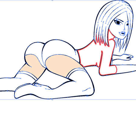
The first step is to quickly draw a sketch defining the basics of the character so we have something to work with in Adobe Illustrator. The face of my drawing looks more like a deformed alien sex doll, but the overall pose and rough proportions are in place. Scan and place this image into Illustrator.
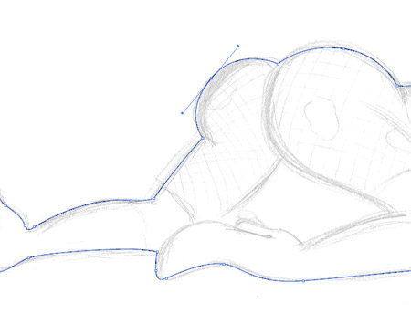
Reduce the transparency and lock the sketch into place (CMD+2), then grab the pen tool and trace the outline of the whole character. New to the pen tool? Check out these tips.
Once the overall outline is complete, begin drawing open ended paths within the body to define the shapes of the character.
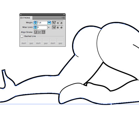
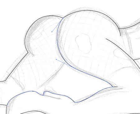
Bump up the weight of the outer stroke to around 5pt and align it to the outside. Give any negative space areas such as the shape defining the area between the legs the same weight, but with the stroke aligned to the inside.
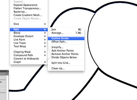
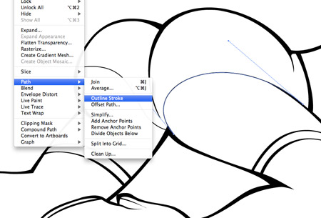
Select the thick outline and go to Object > Path > Outline Stroke. This will convert the stroked path into a solid shape.
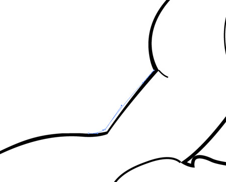
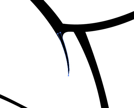
Use the Direction Selection tool to manipulate and alter the points of the path outline to give the impression of a brush stroke. These subtle changes in width do a great job of enhancing the illustration with a hand-drawn inked style.
The new ‘inked’ effect lines look much better than the plain strokes. Use areas with multiple points to create thick transitions between lines, such as the knee area of the right leg.
Begin drawing in the detail lines with the Pen tool, then outline each stroke and manipulate the paths. Tweak any open ended lines so they taper into a point to further replicate the brush stroke effect.
You can manually add tapered points to specific areas to help define the shapes of the body. Just draw the triangular shape with the pen tool, then rotate and carefully move it into place.
The design really starts to take shape when the finer detail linework is added. Here I’ve also completely recreated the face and hair by manually drawing new elements directly. The great thing about working digitally is that paths can be tweaked and edited, unlike a pencil drawing.
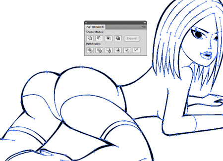
Draw a selection around the whole illustration and outline any leftover strokes, then click the Merge option of the Pathfinder to blend it all together into a solid shape.
This merged outline then allows use to use Illustrator’s Live Paint Bucket tool to quickly fill each area with a block of colour. Select a colour swatch then click the red outlined areas to add that particular colour fill.

Continue adding colour fills with the Live Paint Bucket tool, then go to Object > Expand and select just the Object option to convert the fills into editable shapes.
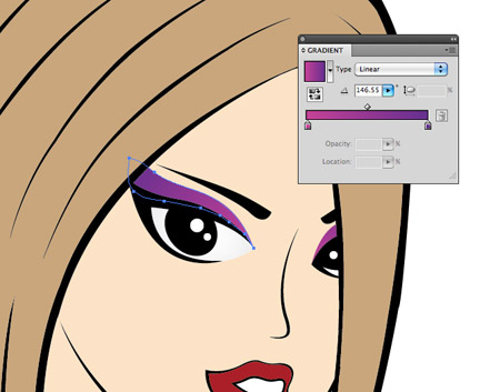
The area around the eye wasn’t outlined, so the Live Paint Bucket filled the eye with the same skin tone. Draw a white shape to compensate for this and adjust the stacking order so it sits below the black linework but above the facial colour fill. Add colourful makeup to the eye area and some small specular highlights. The eyes of any character are the most important feature, so take the time to add a few extra details.
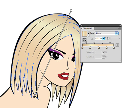
Select the main hair object and switch the solid colour fill for a gradient to add radiance and shine. Use a range of browns and yellows to recreate a blonde type hair colour, then adjust the gradient angle.
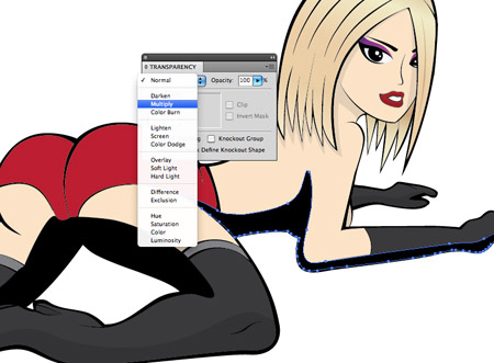
Draw a series of flowing shapes across the underside of the character to act as shadows. Follow the black outline roughly, then cut across the inner areas of the character with smooth paths. Change these fills to Multiply at 10% opacity.
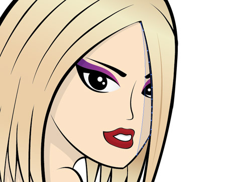
Add these shading shapes to areas of the face taking into consideration elements that would likely cast a shadow, such as the hair flowing over the face, or the head over the neck.
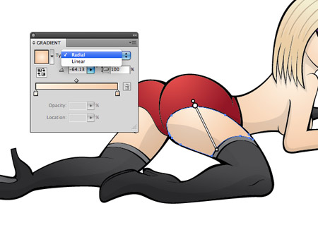
To really add depth and dimension to the illustration, switch out the solid colour fills with subtle gradients. Give each area of skin a radial gradient that gradually flows from light to dark tones. Adjust each gradient with the gradient tool so it flows in smoothly from outside the shape area.
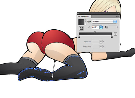
Giving the black boots a dark to light grey gradient helps define their shape by giving the impression of light and shade.
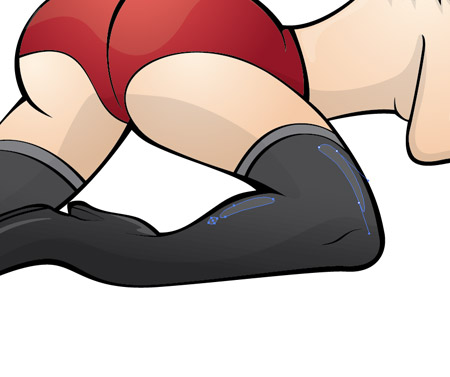
To replicate a glossy or shiny appearance, add some basic highlighting shapes to the boots. Set these shapes to 10% White with the Screen blending mode.
With all the colour fills and shading in place the character really comes to life as a cute and sexy blonde…
…or alter the colours slightly and you have a ravishing rock chick! ;-)
Download the source file