vendredi 31 août 2012

Blog.SpoonGraphics | Latest Blog Entry

Blog.SpoonGraphics | Latest Blog Entry


Art & Design Inspiration Fix for August 31st 2012

Posted: 30 Aug 2012 11:00 PM PDT

The Art & Design Inspiration Fix pulls together a collection of my favourite graphical images that I've come across over the past week to give you a fix of creative inspiration. This week we have designs from Robert Fori, Renato Cunha, Federica Bonfanti, Helms Workshop and Kid Grandios.

Dronograph Typography by Robert Fori

Rihanna by Renato Cunha

One Day by Federica Bonfanti

Jack Daniel’s by Helms Workshop

93 by Kid Grandios

lundi 27 août 2012

Blog.SpoonGraphics | Latest Blog Entry

Blog.SpoonGraphics | Latest Blog Entry


6 Photoshop Alternatives for the Casual Designer

Posted: 26 Aug 2012 11:00 PM PDT

Photoshop isn’t just an industry standard piece of image manipulation software used by professionals, it’s also an application that is sought after by many hobbyists looking to fulfil their creative passion. Unfortunately at $600 dollars it’s out of reach for most casual users, so other than pirating (which is bad mmkay), what high quality alternatives are available for the casual designer?

Pixelmator ($15)

If you’re a Mac user you are in luck. In my opinion the best alternative to Photoshop is the Mac only app named Pixelmator. With a lack of CMYK and print related features it doesn’t quite match Photoshop in terms of professional capabilities, but for image editing, manipulation and just creating cool artwork it’s definitely a strong competitor. Pixelmator also has a great selection of tutorials from its community, many of which from Abduzeedo. If you’re the type of casual designer who just wants to create impressive digital art, Pixelmator is your tool of choice.

GIMP (Free)

Looking for a completely free alternative? Or something that will work on your Windows PC? GIMP is the way to go. The GNU Image Manipulation Program is a free, open source piece of kit that has all the basic image editing tools built right in. Although the interface and workflow is slightly different to Photoshop (which might slow you down if you upgrade to Photoshop later), being open source means there’s a range of plugins and add-ons available. This list of tweaks from Smashing Magazine explains how to make GIMP a serious Photoshop competitor.

Aperture ($55)

If Photography is your business, Apple’s own Aperture app (again Mac only) may actually be more useful than Photoshop could ever be. While Photoshop is a photo editing app at heart it’s bloated with print, web, 3D and animation features that just aren’t used by the average Photographer. Aperture on the other hand is designed specifically for professionally importing and tweaking images from your expensive camera. It includes all the familiar features of Levels and Curves adjustments, but also offers a range of unique adjustments and enhancements.

Photoshop Elements ($100)

Photoshop Elements is a dumbed down version of the full Photoshop package aimed at hobbyists and is priced accordingly at around 1/6 the cost. Elements still includes many of the features of the full version, but with much fewer options. Elements might be a good place to start for anyone venturing into the world of design who hopes to progress onto the full Photoshop package, but if you’re in this situation the Student editions of Photoshop will still save you money while giving you access to all the pro features. For the casual designer who doesn’t plan on making the cost back from project work, there are much cheaper and more powerful programs available.

Pixlr Editor (Free)

What if you have no intention of becoming a top class designer, but still appreciate a nice looking picture every now and again? Rather than pay for some piece of software you’ll never make use of, why not use the web based Pixlr editor to tweak and enhance your images? With direct access to your Flickr, Facebook, Picasa and now Google Drive photos it makes it easy to quickly edit, crop and enhance your images without even needing access to your own computer.

Photoshop Express Editor (Free)

Finally we come to Photoshop Express Editor, Adobe’s own web based image editing program. Where Pixlr features a similar interface to the full desktop version of Photoshop, Adobe’s Photoshop Express lays all its tools and features out in one large column. Need to quickly adjust the white balance of an image? Launch Photoshop Express, click the immediately accessible White Balance button and away you go. You might only be limited to 30 tool options, but it’s all you need to quickly process the odd image into a professional looking photograph.

vendredi 24 août 2012

Blog.SpoonGraphics | Latest Blog Entry

Blog.SpoonGraphics | Latest Blog Entry


Where Can Freelancers Go To Get a Design Contract?

Posted: 23 Aug 2012 11:00 PM PDT

In this week’s question time video I talk about what to do when a client changes their mind during a project, how design contracts can come to the rescue as a freelancer and where you can go to find yourself a design contract template online.

This week’s questions

Tricia Kennedy
When you are near completion on a project and the client sends you a link to an ‘out-of-the-box’ design which they ‘love’ and they hint at not liking the current design (which they said yes to) what do you do?

Links from the video

Contract Killer
Web Design Contract Template
Don’t Get Screwed Over

Writing the Perfect Web Design Contract
What to Include in Your Design Contracts

Ask a question

If you have a question you would like to submit for an upcoming episode add it to the comments below, or send it to me on my Formspring account.

lundi 20 août 2012

Blog.SpoonGraphics | Latest Blog Entry

Blog.SpoonGraphics | Latest Blog Entry


Create a Cool Ribbon Style Logo Graphic in Illustrator

Posted: 19 Aug 2012 11:00 PM PDT

Follow this step by step Illustrator tutorial to create a cool ribbon style logo graphic with gradients and effects in Adobe Illustrator. We’ll create the graphic as a vector design to allow scalability as a logo and add flat and mono versions to keep the logo versatile.

Ribbon style logo graphic

Usually a logo project would involve lots of research in order to develop a brand that reflects the company, but for this tutorial we’ll focus just on the practical task of building a cool looking graphic in Illustrator. The design we’ll be creating features a continuous ribbon style shape wrapping to form a spiral.

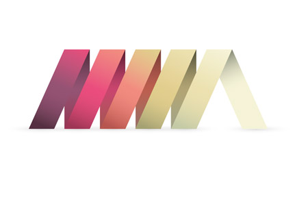
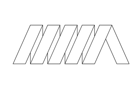
View the final ribbon style logo design

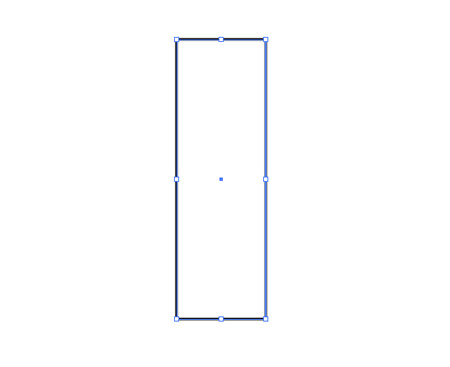
Open up Adobe Illustrator and draw a long thin rectangle on the artboard. Remember, the initial dimensions that you create your logo doesn’t matter seeing as we’re working in vector. Unlike Photoshop the design can be scaled up and down without loss of quality.

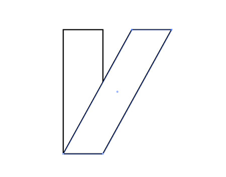
Press CMD+C to Copy then Paste in Front (CMD+F) a duplicate of the rectangle then select the top two points of the overlapping rectangle with the Direct Selection tool. Hold Shift and move these points right to shear the shape.

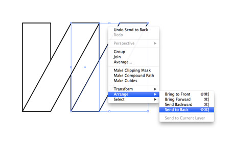
Select both rectangles and hit copy, then paste in front a duplicate. Move them into position horizontally to continue the ribbon then right click and select Arrange > Send to Back to properly follow the pattern.

Zoom right in to the document and press CMD+Y to toggle on outline mode. Select the two new rectangles and carefully line them up where they join with the originals.

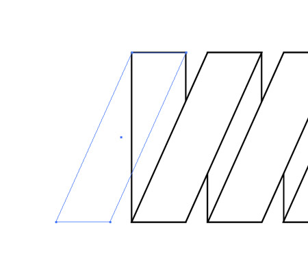
Repeat the process to extend the ribbon, then add one final diagonal rectangle to finish the left edge.

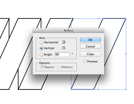
Make a copy of a single diagonal rectangle and go to Object > Transform > Reflect and select the Vertical axis to flip the shape for the opposite side.

Position the flipped rectangle on the right edge to finish off the basic logo artwork.

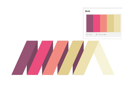
Lay out a colour scheme for your branding or download a cool palette from sites such as ColourLovers.com and begin replacing the default fill/stroke with vibrant colours.

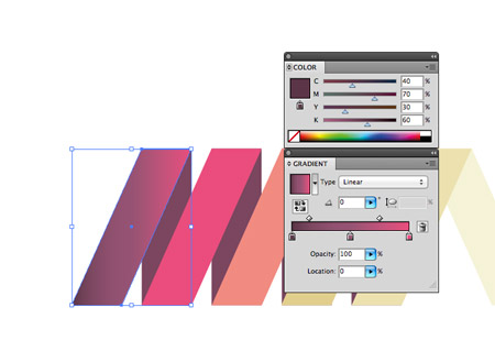
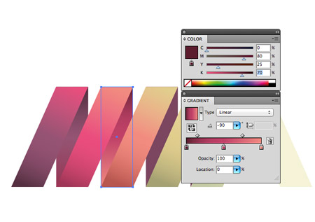
We’ll create a flat colour version of the logo later so let’s continue with the eye candy and make the logo stand out with some cool gradient effects. Make a copy of the logo then replace each segment with a gradient fill. Select the original colour as the centre handle, then choose a darker tone for the first handle and colour pick the next colour for the last handle.

Blending each colour with the next helps enhance the flow of colour across the logo, while the dark to light tones on each rectangle help give the design a slight three dimensional appearance.

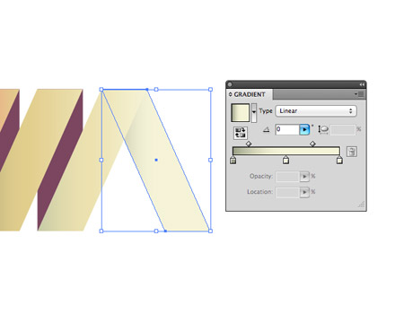
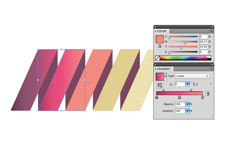
On the last piece choose the lightest colour from the palette but add a shadow effect by blending the gradient to a darker tone.

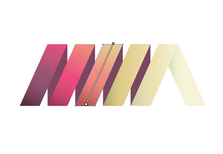
Click & drag with the Gradient tool to adjust the angle of the gradients to flow with the orientation of each rectangle to best see the blend of colour.

Select each of the vertical rectangles and give them the same gradient fill as the nearest rectangle using the eyedropper tool. To maintain the illusion of a spiral these colours need making darker to represent light and shade. Select each handle from the gradient and add more black to each colour to darken all the tones.

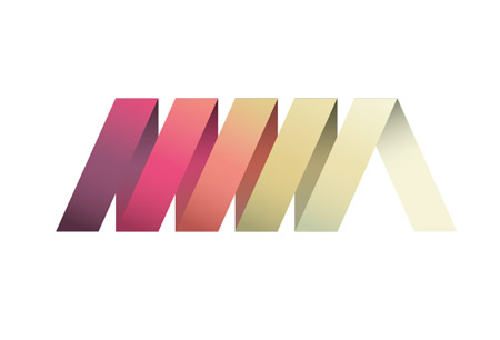
The logo design looks pretty cool with the gradient effects helping the design stand out and jump off the screen.

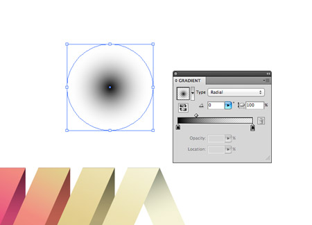
Draw a circle somewhere on the artboard and give it a black to transparent radial gradient fill. Squash the shape by dragging the top handle downwards to create a little shadow graphic.

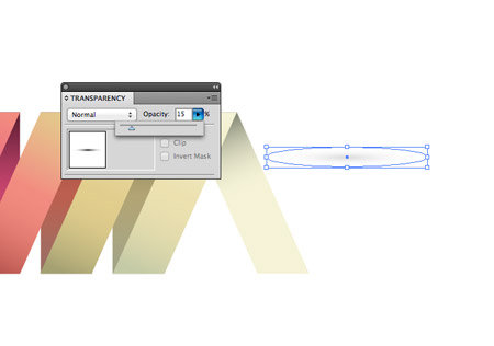
Reduce the opacity of the shadow to around 15% then position it under one of the rectangles’ bottom edges.

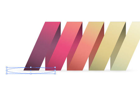
Hold ALT and Shift while dragging the shape to create a duplicate and position shadow graphics along the whole bottom edge.

The shadow effects help ground the logo and allows it to sit within its surrounding space. This is the primary version of the logo complete, but let’s quickly make flat and mono variations to keep the logo versatile.

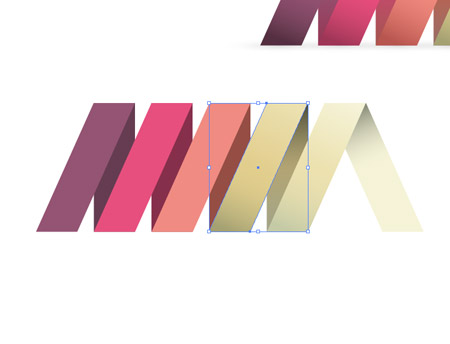
A flat logo is useful for small scales where the gradients and effects wouldn’t reproduce well. Make a copy of the logo and remove all the gradients and shadows, leaving solid colour fills.

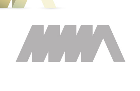
A mono version is useful for when the logo is being placed on unusual backgrounds where the primary logo would be lost. Replace all the colours with a temporary grey.

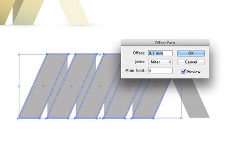
The logo loses all of its definition without a little modification. Select the diagonal segments and go to Object > Path > Offset Path. Add a small amount of offset of around 0.3mm.

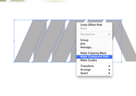
Select all the new offset shapes individually and create a Compound Path.

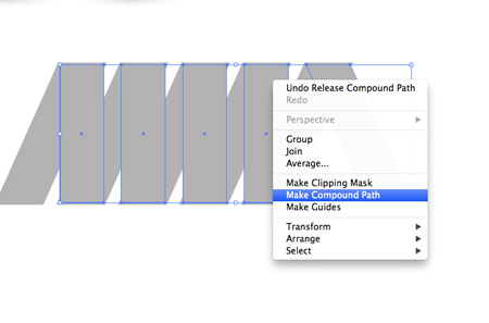
Deselect everything then select just the upright rectangles and the last diagonal segment and create a new Compound Path.

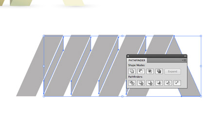
Shift-Select both compound paths then hit the Subtract option from the Pathfinder palette to punch out the offset shapes from the original rectangles to leave a stroke effect. The mono version is now recognisable and can be used in any colour.

Ribbon style logo graphic

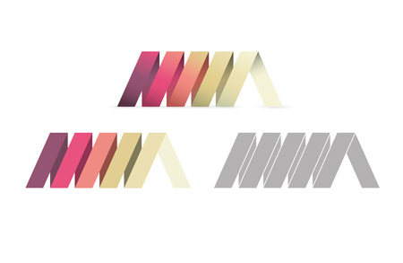
This leaves the cool ribbon style logo design complete and ready to send off to our fictional client. The primary version looks great with all the gradients and effects, and will retain its quality when scaled. Then there’s the flat and mono versions that maintain the logo’s versatility and allow it to be reproduced anywhere.

Download the source file