vendredi 28 octobre 2011

Blog.SpoonGraphics | Latest Blog Entry

Blog.SpoonGraphics | Latest Blog Entry


Art & Design Inspiration Fix for October 28th 2011

Posted: 27 Oct 2011 11:00 PM PDT

The Art & Design Inspiration fix pulls together a collection of my favourite graphical images that I've come across over the past week to give you a fix of creative inspiration. This week we have designs from Brian Yap, Rich, Leonardo D’Aubeterre, Shebid and Jorge Lawerta.

Dead Confederate Poster by Brian Yap

Beauty and the Beast by Rich

Au pere tranquille by Leonardo D’Aubeterre

Too Bright to See by Shebid

Buenos Aires Neighbourhoods by Jorge Lawerta

mardi 25 octobre 2011

Blog.SpoonGraphics | Latest Blog Entry

Blog.SpoonGraphics | Latest Blog Entry


How To Design a Print Ready Die-Cut Business Card

Posted: 24 Oct 2011 12:00 AM PDT

Need a new set of business cards? Follow this step by step tutorial to create a cool business card design in Adobe Illustrator. We’ll begin creating the vibrant pattern effect, then we’ll lay out the contact information and set up the final print ready file ready for sending off to your chosen print firm.

Die Cut Business Card Design

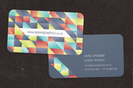
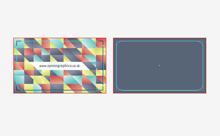
The business card design we’ll be creating as part of this tutorial features a vibrant pattern on the rear of the card, with a minimal design on the front allowing the contact information to stand out. The final printed card will be die-cut with round corners, so we’ll set up the print ready file appropriately with the correct dimensions, bleed and margins.

View the final die-cut business card design

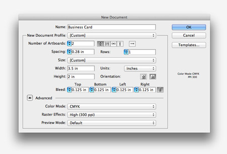
Open up Adobe Illustrator and create a new document. I’m using UPrinting for this business card design, so I’ll use their dimensions of 3.5″ by 2″ with 0.125″ of bleed. This deign will be double sided, so enter 2 in the Number of Artboards setting.

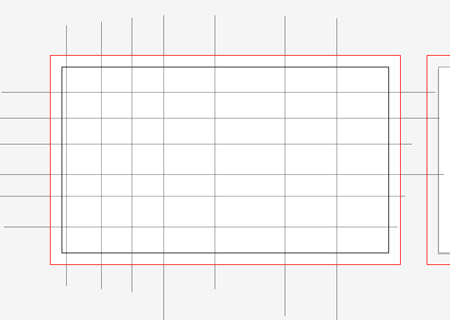
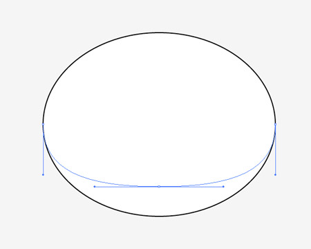
Draw a white rectangle across the whole of the first artboard, including the red bleed outline. Use the Line tool to begin drawing intersecting lines both horizontally and vertically.

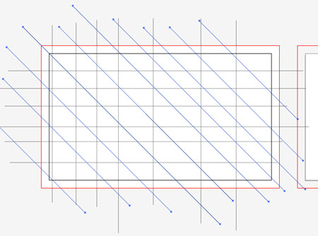
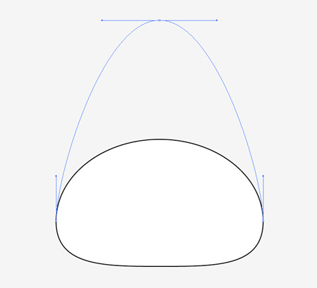
Add more intersecting lines to the design, this time diagonally by holding down the Shift key.

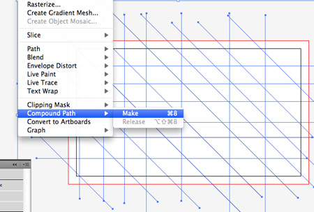
Select all the intersecting lines and convert them into a Compound Path by selecting the menu option or hitting CMD+8.

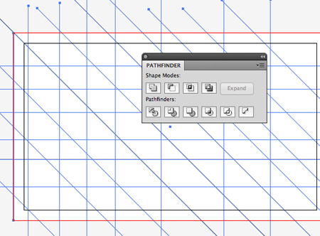
Add the white rectangle to the selection, then click the Divide option from the Pathfinder palette.

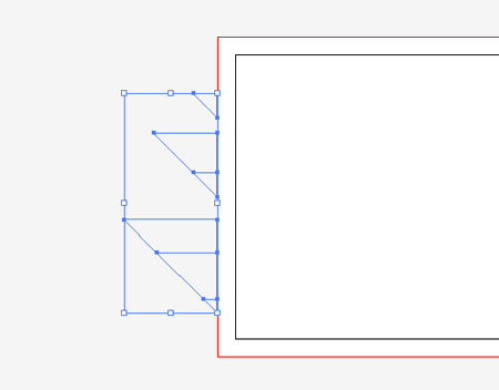
Right click and select Ungroup, then draw a selection across the linework beyond the edges of the document to delete them.

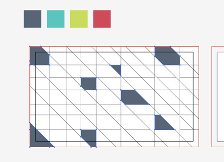
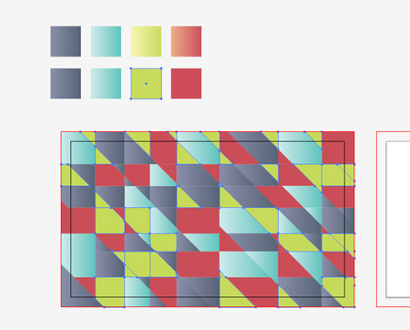
Set out a colourful colour scheme for your design (this one’s from ColourLovers), then begin filling random shapes with the first colour from the palette.

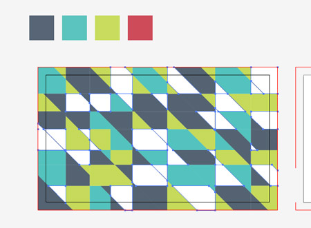
Continue cycling through the colours to fill the empty shapes with swatches from the palette.

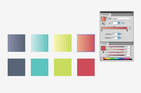
Make a duplicate of the colour swatches and create vibrant gradients from the base colour to a lighter tone.

Use the Magic Wand tool to select all the shapes with the first colour from the palette, then use the Eyedropper tool to replace the flat colour fill with the new gradient.

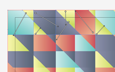
Once all the shapes have gradient fills applied, zoom in and use the Gradient Tool to alter the direction of the gradient randomly for each shape.

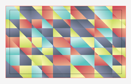
The random fills and alternating directions of the gradients creates a really cool pattern effect to fill up the rear of the card.

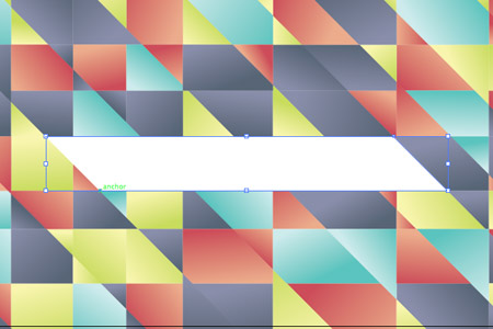
Toggle on Smart Guides then use the Pen tool to fill a selection in the centre of the card to allow space for a website URL.

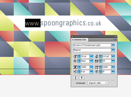
Enter the address of your website in your favourite font, then adjust the sizing slightly to lower the prominence of the prefix and suffix. Give it a fill using the darkest colour from your palette.

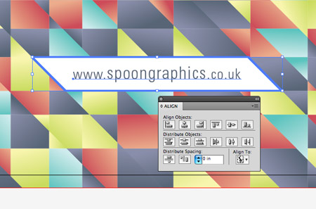
Select the text element and its surrounding shape, then give the shape an extra click to select it as the key object. Use the Align tool to centre the text to its container.

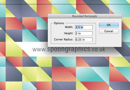
Grab the Rounded Rectangle tool and click on the artboard to enter specific dimensions. Enter 2.5″ by 2″ with a 0.25″ radius.

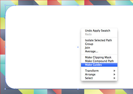
Right click on the newly created rectangle and select the Create Guides option. This will create a guideline to give an insight into how the card will be cropped down during printing.

With the front of the card complete it’s time to move onto the rear. Fill a rectangle covering the second artboard with a swatch from the colour palette.

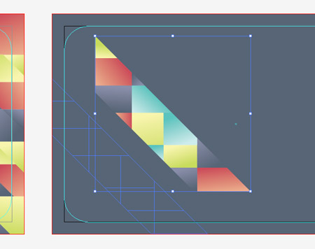
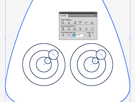
Select and copy a series of vibrant shapes from the front of the card and position them on the rear to continue the pattern. Position these shapes running across the lower left of the card.

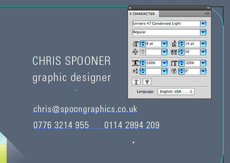
In the remaining white space use the Text tool to enter your name, job title and contact details using the typeface of your choice. Give certain text elements more visual prominence by altering its case and size.

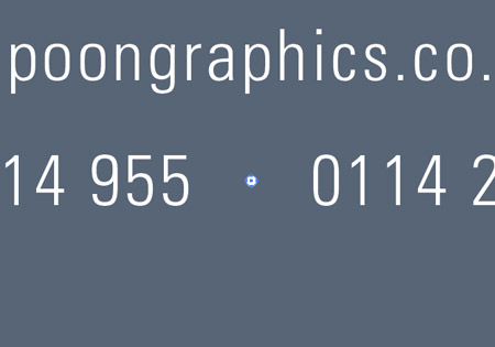
The two contact telephone numbers are laid out side by side, so draw a small bullet with the circle tool to separate them.

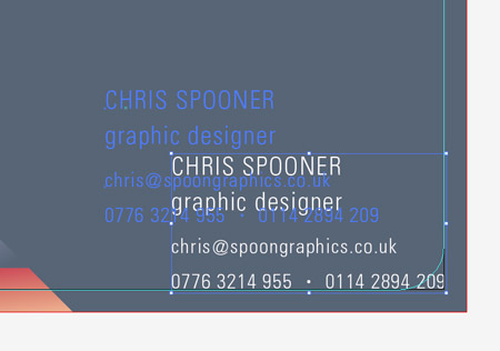
Align the text elements, then move them exactly into the lower right corner. Hold the Shift key then move the text elements back into their own space.

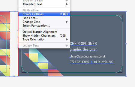
The overall design of the business card is complete, now let’s prepare the file for print. First select all and convert all text elements to outlines to avoid any font related problems with your printer.

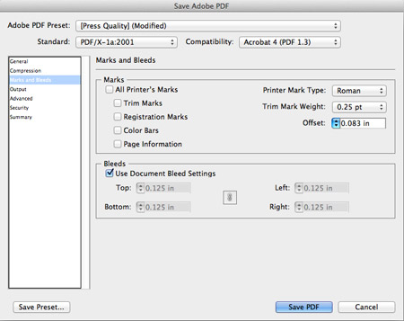
Go to File > Save As and select the PDF option. In the settings alter the preset to Press Quality then alter the standard to whatever is recommended by your printer. In this case it’s PDF/X-1a:2001. You also have the options of adding crop marks, but in this case they aren’t necessary so just the Use Document Bleed Settings option is checked.

Die Cut Business Card Design

Your print ready business card design is ready for sending off to your printer of choice. When they arrive in the post you’ll see the final product cropped to size according to the dimensions set in your print file.

Download the source file

vendredi 21 octobre 2011

Blog.SpoonGraphics | Latest Blog Entry

Blog.SpoonGraphics | Latest Blog Entry


MOO Christmas Card Prints Giveaway for Members

Posted: 20 Oct 2011 11:00 PM PDT

Like it or not Christmas is getting close, so now would be a good time to think about your Christmas themed design material. Show your appreciation to your clients with personalised cards, or send something special to your friends and family. The kind folks from MOO have kindly arranged a ...

Log in to your Access All Areas account to read the rest of this post.

Not a member? Becoming an Access All Areas member gives you the ability to view exclusive members-only content just like this. The premium category is already packed full of discount codes and useful design resources, and there's plenty more to come! Find out more about becoming a member, or take a peek at what's available to premium members so far.

lundi 17 octobre 2011

Blog.SpoonGraphics | Latest Blog Entry

Blog.SpoonGraphics | Latest Blog Entry


How To Create a Cute Hairy Vector Monster Character

Posted: 16 Oct 2011 11:00 PM PDT

Follow this step by step Illustrator tutorial to create a cute vector monster character. We’ll create the character from basic shapes to give a cute and friendly appearance then we’ll bring the character to life with gradient colours and a detailed fur effect.

Vector Monster Character

The fantasy woodland monster we’ll be creating is made up of lots of simple rounded shapes to give the character a friendly appearance. The large eyes in relation to the size of the body is the key ingredient to creating a cute and lovable character.

View the final cute monster character

Open up Adobe Illustrator and draw an ellipse on the artboard. Select the Direct Selection tool then drag the lowermost point vetically upwards to flatten off the lower edge.

Select the uppermost point and drag it vertically to create more of a pointed shape.

Inside the body area use the circle tool to draw the outlines of an eye. Copy (CMD+C) and Paste in front (CMD+F) each new circle then scale it down while holding the Shift and Alt keys.

Make a duplicate of the eye shapes then group them together. Select the eyes along with the body outline, then give the body outline a second click to set it as the key object. Use the Align palette to centre everything up.

Flatten the upper edge of a smaller ellipse using the Direct Selection tool to create the basics of a mouth.

With the mouth selected, go to Object > Path > Offset path and enter 3mm in the options window. Right click the shape and select Ungroup.

Draw two smaller ellipses to represent two teeth, then make a copy of the inner mouth shape. Use this shape as a tool along with the Pathfinder palette to trim the teeth shapes to size.

Group three ellipses to represent simple feet, then position them underneath the other objects using the CMD+Shift+[ shortcut.

Draw a black circle elsewhere on the artboard then drag out the right-most point horizontally. Use the Convert Anchor Point tool to create a sharp point, then press the 'new' icon at the bottom of the Brushes palette.

In the options make sure the direction of the brush is correct, then change the Colorization Method to Tints.

Use this brush with the Brush tool to draw a series of lines around the edge of the character.

Select one of the black brush shapes and go to Select > Same > Appearance, then go to Object > Expand Appearance to convert the strokes to solid shapes.

Shift-Click the main body shape to add it to the selection then hit the Merge option from the Pathfinder window to blend all the shapes together.

Give the shape a brown fill, then add an Inner Glow effect using a slightly lighter brown tone. Change the settings to Normal and adjust the size to suit.

Begin adding a range of gradient fills to the eye shapes. Use a subtle grey to white on the outer shape, a bright series of colours for the iris and a black to dark grey for the pupil.

Give the two extra white circles 70% opacity to help them give the impression of a specular highlight.

Select just the outer shape from the eye group and go to Effect > Stylize > Drop Shadow. Adjust the settings to 0 offset and 100% opacity. Adjust the size to around 5mm.

Fill the mouth shapes with the relevant colours, then add an Inner Glow effect to the lips to give a lighter red fade around the edges.

Finish off the colouring process with some simple radial gradients on the feet.

Use the custom brush we created to draw more shapes with the Brush tool. Use a random colour to make them easy to identify. Draw rows of shapes until the whole body shape is covered.

Select one of the new shapes then go to Select > Same > Appearance to select all the shapes, then go to Object > Expand Appearance.

Give these shapes a gradient fill using a light brown tone. Set one of the gradient handles to 0% opacity then adjust the gradient angle to flow vertically.

One layer of hair shapes add some cool detail to the character, but two layers really add an extra level of depth. Use the brush tool again to draw another series of brush strokes.

Go to Select > Same > Appearance then click the Object > Expand Appearance option to convert the strokes to shapes.

The extra fur will currently be overlaid over the facial features. The easiest way to select these shapes it to begin with the main body then use the Select Next Object Above command. Once selected, hit the CMD+Shift+] shortcut to send the objects to the top.

Vector Monster Character

This leaves our cute little monster character complete. Despite being built from simple shapes the gradients and fur effect really help bring the character to life.

Download the source file