lundi 29 août 2011

Blog.SpoonGraphics | Latest Blog Entry

Blog.SpoonGraphics | Latest Blog Entry


How To Create a Retro Style Typographic Poster Design

Posted: 28 Aug 2011 11:00 PM PDT

Follow this step by step tutorial to create a retro style typographic poster design with distressed textures and a muted colour scheme. We’ll create a typographic layout based on the number ‘one’ using Illustrator’s easy manipulation tools, then switch over to Photoshop to lay out the poster design composition and grunge everything up with some textures to create that cool dated retro look.

Retro Typographic Poster Design

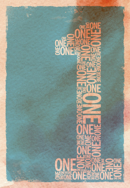
The design we’ll be creating is based on the number ‘one’. It features a typographic design made up of duplicates of the word ‘one’ to build up a numerical number one symbol. The overall design is then composed into a poster and given that cool old school retro appearance with stains, textures and distressed elements.

View the final retro typographic poster design

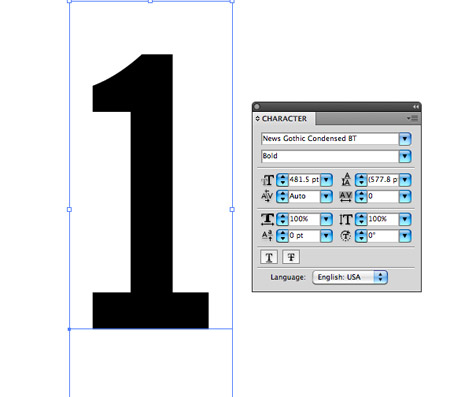
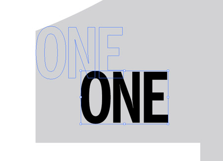
We’ll create the main typographic layout in Illustrator to make use of the vector abilities to maintain crisp edges on our text elements. Type out the number one in a font of your choice. I’m going for the classic News Gothic in a bold weight to give us plenty of space to fill.

Give the number object a light grey fill then lock it into place using the CMD+2 shortcut. This will help avoid us accidentally selecting it when manipulating the smaller elements.

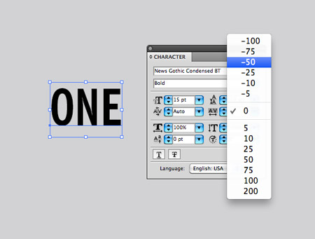
Use the same font to type out the actual word ‘ONE’. Adjust the tracking to tighten up the spacing between the letters. Press CMD+Shift+O to convert the text to outlines.

Choose a corner to start laying up the text elements and align the first of many objects to the grey background guide.

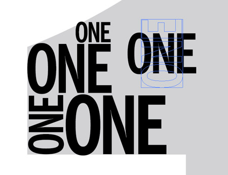
Hold ALT and drag to create a duplicate of the text object, then scale and rotate while holding shift to vary the sizes and angles.

Pay close attention to the lines naturally created by the stacking of text elements and paste copies of the words in to fit.

Continue duplicating, scaling and rotating new elements to fill the whole grey area, working from top to bottom.

Place a few key elements in the corners to outline the main basic shape, then add duplicates to fill out the inner area.

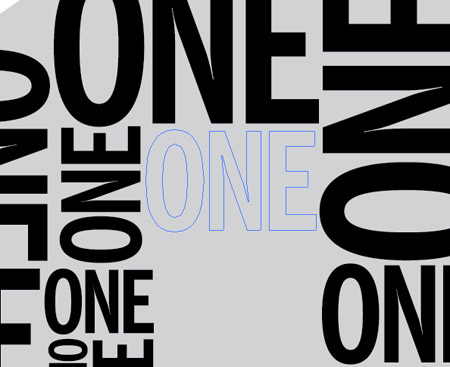
In no time the whole design will be filled with repeating elements. Take a step back to check for uncomfortable areas that may include too many large or small items.

Press CMD+Alt+2 to Unlock All. Draw a selection across all the elements, then Shift-click to remove the background guide from the selection.

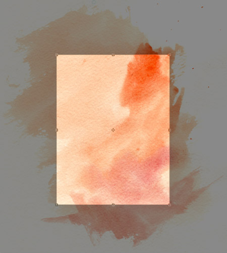
Open up a high res watercolour texture in Photoshop to use as a background. Use the Crop tool to clip the background down to exclude any white page.

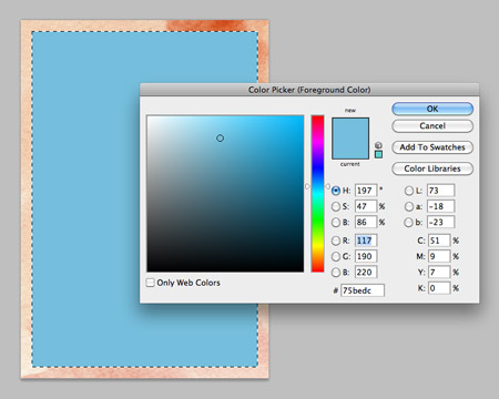
Press CMD+A to select all, then right click and select Transform Selection. Scale it down slightly to create a border effect then fill the inner portion with a bright colour.

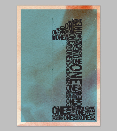
Change the blending mode to Multiply to allow the underlying texture to show through, then paste in the typographic elements from Illustrator. Arrange the composition to extend from the lower right corner.

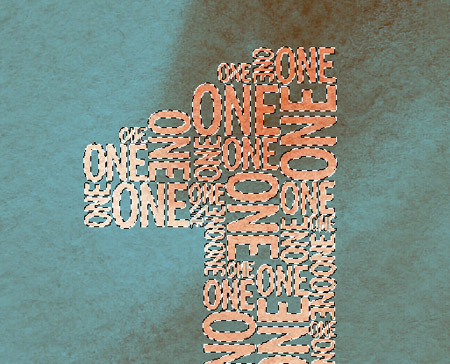
CMD+click on the typographic layer’s thumbnail to load the selection, then delete this selection from the blue panel layer to create a mask or basic screenprint style effect.

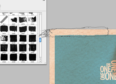
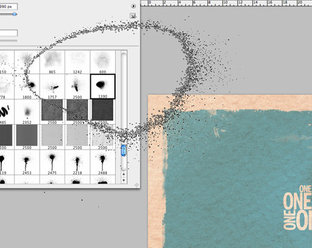
Add a layer mask, then use a selection of rough Photoshop brushes to distress the edges. Open up the Brush palette to adjust the angle of the brush in order to use the brush on all four sides.

Use a range of brushes from brush strokes to spray paint to add a wealth of different textures.

The Photoshop brushes do a great job of creating that aged, weathered appearance common in any old document that has stood the text of time.

All that’s left is to give the poster a typical creased appearance to give the impression that it has been folded during years of storage. Paste in a folded paper texture file above all other layers and change the layer style to Screen. Adjust the opacity to tone down the impact of the crease lines.

Retro Typographic Poster Design

This leaves out cool retro screenprint style typographic poster design complete. Why not get right on with creating a complete series of posters, starting with the number ‘Two’. The collection would look awesome if each poster had a unique colour.

View the retro typographic poster design

Download the source file

vendredi 26 août 2011

Blog.SpoonGraphics | Latest Blog Entry

Blog.SpoonGraphics | Latest Blog Entry


Heart Internet 30% Web Hosting Discount for Members

Posted: 25 Aug 2011 11:00 PM PDT

Heart Internet has set up an exclusive 30% discount on their Business Pro hosting plans for Access All Areas Members. The Business Pro web hosting package is their premium hosting plan and comes with unlimited web space, bandwidth, databases and email accounts, plus the ability to host multiple websites on ...

Log in to your Access All Areas account to read the rest of this post.

Not a member? Becoming an Access All Areas member gives you the ability to view exclusive members-only content just like this. The premium category is already packed full of discount codes and useful design resources, and there's plenty more to come! Find out more about becoming a member, or take a peek at what's available to premium members so far.

lundi 22 août 2011

Blog.SpoonGraphics | Latest Blog Entry

Blog.SpoonGraphics | Latest Blog Entry


Create a Cute Vector Penguin Character in Illustrator

Posted: 21 Aug 2011 11:00 PM PDT

Follow this step by step Adobe Illustrator tutorial to create a simple vector penguin character. We’ll be using many of Illustrator’s basic shapes to create the structure of the character, which makes this tutorial great for beginners. We’ll then make use of various gradients to really bring the character to life with depth and dimension.

Vector Penguin character

Here’s our cute little chubby penguin character we’ll be creating as part of this tutorial. The whole body is created from various circles and ovals which help give the penguin that cute and friendly appearance, while the gradients and shading help lift the character from the screen with a three dimensional illusion.

View the full size penguin character

Open up Adobe Illustrator and draw an oval on the artboard, then select and drag the lower most point vertically upwards with the Direct Selection Tool.

Overlap another oval shape to outline the belly fur, then align the two shapes centrally along the Y-Axis.

We’ll need to trim down this new shape so copy (CMD+C) and paste in front (CMD+F) a duplicate of the original body outline and send it to the top (CMD+Shift+]). Select this duplicate along with the belly shape and hit the Intersect option from the Pathfinder palette to trim it to size.

Draw another oval to act as a wing. Paste in another copy of the body and use it to trim down the wing shape.

Copy and paste another wing onto the artboard then go to Object > Transform > Reflect. Position the new wing on the opposite side of the body.

Draw a basic foot using three angled ovals. Merge them all together with the Pathfinder palette, copy, flip and position a duplicate on the other side.

Create an eye using three differently sized circles. Offset the pupil to give the penguin a cute dazed look. Copy, paste and flip a duplicate of the eye shapes and position them next to the originals.

Use another oval as the penguin’s beak, but drag the lower most point downwards and adjust the bezier handles to make a slight point on the lower edge.

Now the basic structure and linework is complete we can begin bringing the character to life with colour. Replace the default fill and stroke with a grey to black gradient then adjust the angle so it flows radially from the centre of the body.

Give the eyes a subtle gradient of their own using a soft grey to white. Adjust the gradient shape to match the outline of the eyeball.

Use a similar grey to white gradient on the belly shape. Adjust this gradient so the lower portion has more grey shading to give a three dimensional appearance.

For the wings we’ll use the Gradient Mesh tool. Fill the wings with black first of all, then make a single click in the lower portion of the wing. Select a lighter shade of grey to add this colour to the gradient mesh point. Illustrator will automatically flow the gradient across the shape.

Add another gradient mesh to the beak, but this time start with an orange base colour and add a light yellow tone near the top edge to act as a highlight.

Create a couple of nostrils by overlapping two circles. The bottom circle should be the lighter yellow tone to create a kind of highlight effect.

Add the grey to black gradient to the two remaining circles around the eyes as linear gradients, then reduce the opacity to around 50%.

Our penguin is really starting to come to life now it has colour, but there’s a couple more little touches that will help add more definition.

Select the beak and eyes then go to Effect > Stylize > Drop Shadow. Alter the offset to zero then add the effect.

Elsewhere on the artboard draw a small oval with a grey to transparent linear gradient fill.

Hold Shift and Alt to drag a duplicate horizontally, then repeatedly press CMD+D to create a complete line. Hold Alt while dragging a copy of the whole line to create an offset row, then press CMD+D until you have a whole series of patterned shapes.

Group all the shapes together then overlay them over the penguin’s belly area. We’ll need to copy the belly shape to use as a tool with the Pathfinder so press CMD+2 to lock the pattern shape so you can select the underlying elements.

Paste in the belly duplicate and send it to the top (CMD+Shift+]), then with both elements selected (CMD+Alt+2 to unlock all) hit the Crop button from the Pathfinder palette.

Go to Object > Envelop Distort > Make with Warp and select the Bulge effect. Adjust the setting to give the feather pattern a more three dimensional appearance.

Convert the envelope distort effect to solid shapes by heading to Object > Expand and selecting just the Object checkbox.

The pattern has broken out of the original belly outline, so paste in another copy of the shape and repeat the Crop function from the Pathfinder to trim everything back to size.

Adjust the opacity of the feather pattern elements so they add to the detail of the character but aren’t too overpowering.

Vector Penguin character

Our cute vector penguin is now complete. We’ve managed to create a whole character using nothing other than circles and ovals, with the help of gradients and shadows to add a touch of depth and dimension to the design.

Download the source file