If you’ve been a reader of my blog you’ll know I love a good badge or emblem style logo design. I’ve done a couple of tutorials before and featured plenty of great examples in showcases. Today I fancied creating another logo of my own, so I used the IGN Alliance network my @spoongergaming alter-ego is a part of to create a military style emblem. Follow this step by step Illustrator to see how the whole thing was put together, using various tools to create the range of vector shapes.
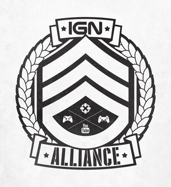
IGN Alliance is IGN’s YouTube network for gamers. This little emblem I put together uses a military theme to relate to first person shooters like Call of Duty and Battlefield. The logo uses a Staff Sergeant insignia surrounded by a wreath with two large banners, all constructed from scratch with Illustrator’s vector tools.
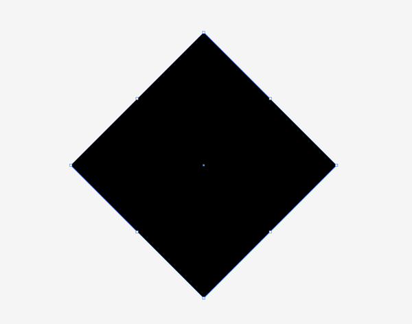
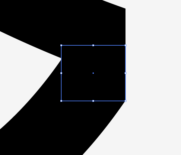
We’ll begin with the sergeant insignia, draw a black square on the artboard then hold Shift and rotate it by 45 degrees.
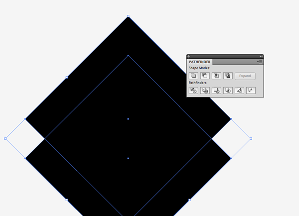
Hold ALT and Shift while clicking/dragging a duplicate of the rectangle. Position it to create the first chevron shape then Intersect the two objects with the Pathfinder tool.
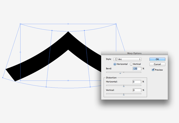
Go to Object > Envelope Distort > Make with Warp and add an Arc distortion of around 20% to bend the shape slightly.
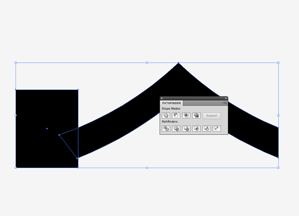
Use temporary rectangles as tools with the Pathfinder Subtract option to clip off the sides to create straight edges.
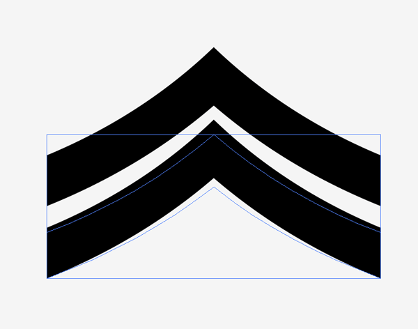
Create a couple of duplicates by dragging the shape while holding ALT and Shift. You’ll notice the bends don’t align perfectly, so squash the shapes slightly to create a parallel gap.
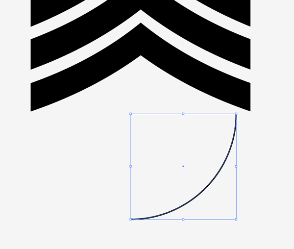
Draw a circle then select 3 of the 4 points using the Direct Selection tool and delete them, leaving a quarter circle.
Rotate this quarter circle by 45 degrees then increase its stroke weight to match the thickness of the chevron shapes.
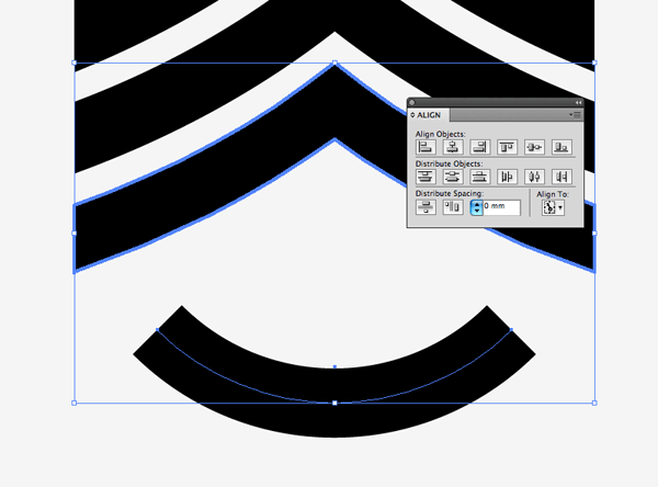
Shift and select the quarter circle path and one of the chevron shapes. Give the chevron an extra click to make it the key object then Align the elements vertically. Making the chevron the key object prevents it from moving out of place.
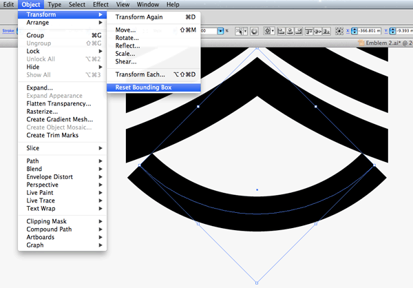
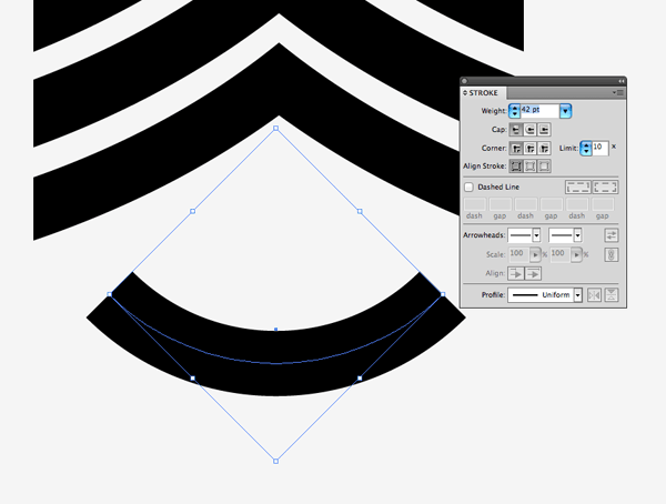
Select the quarter circle and scale it to match the width of the chevrons, then go to Object > Transform > Reset Bounding Box. Use the lower bounding box handle to stretch the shape and create more of a curve.
Zoom in and make any final scaling adjustments so the strokes match up perfectly, then draw little rectangles to fill in the gaps.
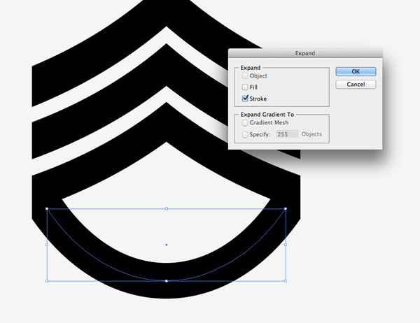
The shape looks solid to the eye but the curved shape is still made using a path. Go to Object > Expand and select the Stroke option to convert this path into a solid shape.
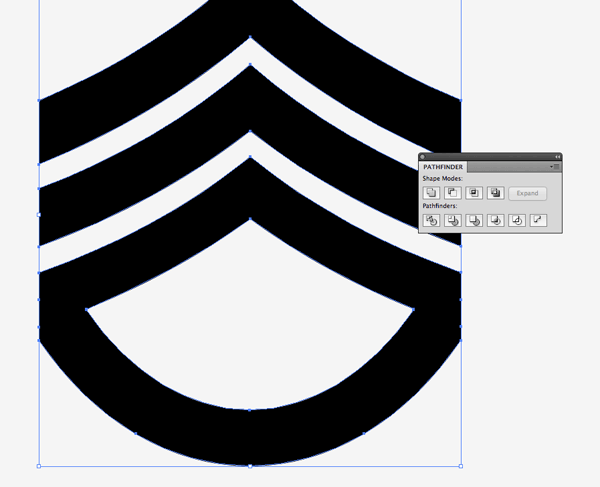
Draw a selection around all the elements then hit the Merge option from the Pathfinder palette to blend all the individual shapes together.
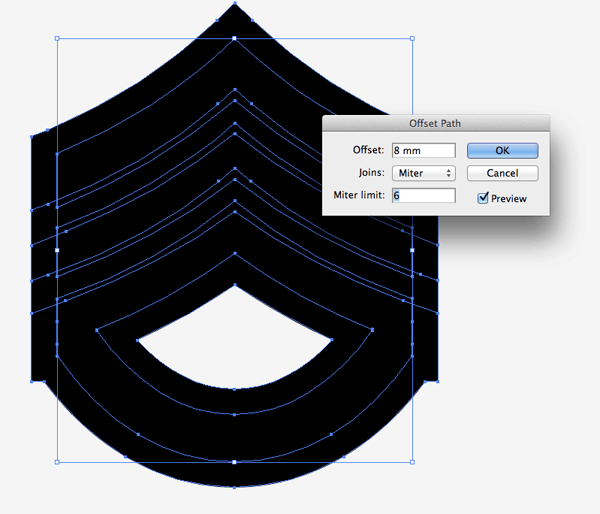
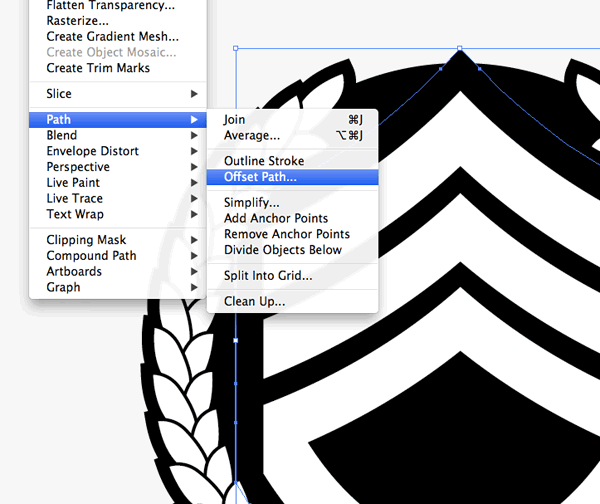
Next, go to Object > Path > Offset Path. Enter around 8mm in the options. Right click and Ungroup the various elements so the original sergeant insignia shapes can be selected and grouped again.

Merge any fragmented shapes from the offset path together, then send the outline to the back (CMD+Shift+[)and delete or adjust any points that make up unwanted areas.
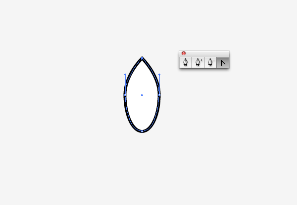
Elsewhere on the artboard draw an oval with the ellipse tool. Use the Convert Anchor Point tool from the Pen toolbar to create a point at the top. Give this shape a 2pt black stroke.
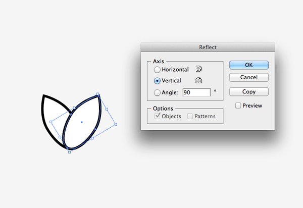
Rotate the shape slightly, then copy (CMD+C) and paste in front (CMD+F) a duplicate. Go to Object > Transform > Reflect to flip this shape in the opposite direction.
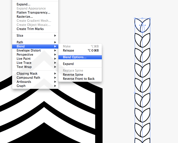
Group the shapes, then hold ALT and Shift and drag a copy a considerable way up the artboard. Select the two then go to Object > Blend > Make. Head back to Object > Blend > Blend Options to adjust the count under Specified Steps until the leaves begin to overlap.
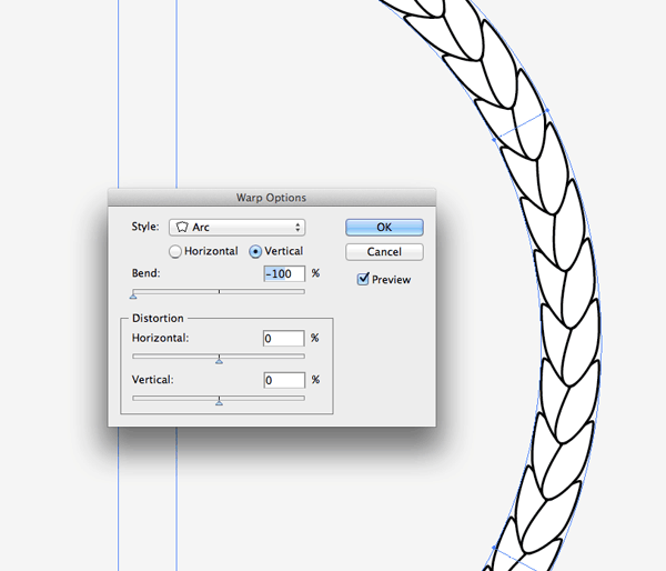
Go to Object > Envelope Distort > Make With Warp and add a Vertical Arc distortion at 100% to bend the series of leaves into a semi-circle.

Go to Object > Expand and select the Object checkbox, then use the Direct Selection tool to select and delete out a couple of leaves from the top so the wreath doesn't form a complete circle.
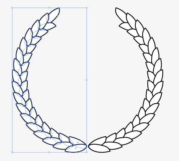
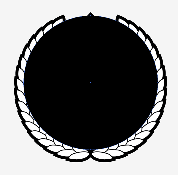
Copy, paste and flip a duplicate of the wreath shapes to form a circular layout. Group these elements together.
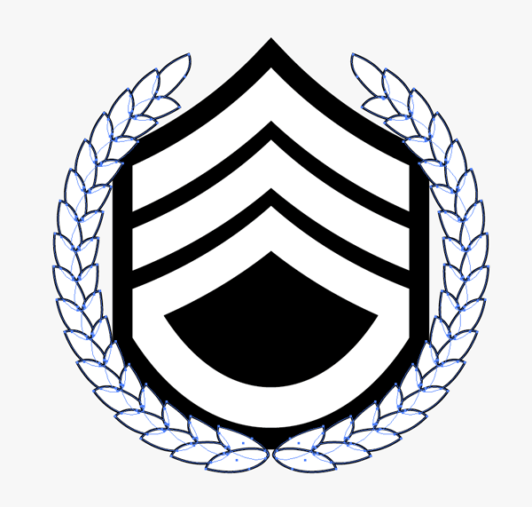
Scale and position the wreath over the insignia. Allow some of the leaves to overlap positions of the emblem.
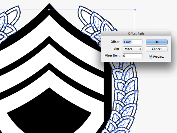
Add an Offset Path of around 3mm to the wreath elements. Ungroup the shapes to select the offset path elements separately from the original leaves.
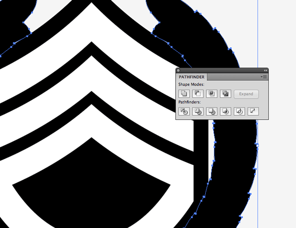
Merge all the offset path shapes together using the Pathfinder then give it a complete black fill. Press CMD+[ to alter the stacking order and send the offset path below the wreath and emblem.
Use the ellipse tool to draw a circle encompassing all the gaps within the centre of the design, then hit CMD+Shift+[ to send it to the bottom of the stack.
Select the black background shape from the sergeant emblem and go to Object > Path > Offset Path. Enter 3mm in the options.
Give this new offset shape a white fill to differentiate it from the black backgrounds.
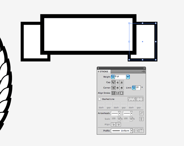
Elsewhere on the artboard draw rectangles to create a simple banner illustration. Give these shapes a white fill with a thick black stroke.
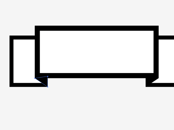
Use the Pen tool to fill out gaps with black shapes to give the impression of folding edges. Zoom right in and use Smart Guides (CMD+U) to snap to the existing points.
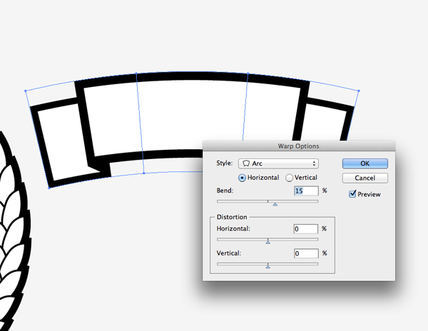
Give this shape a slight Arc using the Envelope Distort tool. Position this banner at the top of the logo design, aligning it centrally with the existing elements.
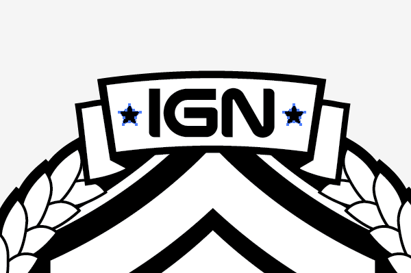
Decorate the banner with some text or a logo along with a couple of star shapes to fill out any unused space.
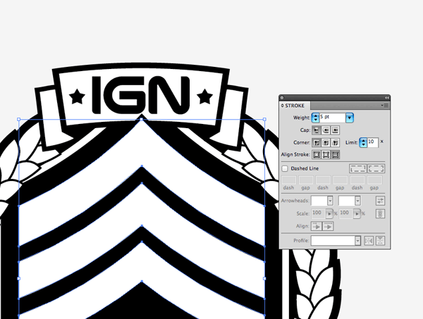
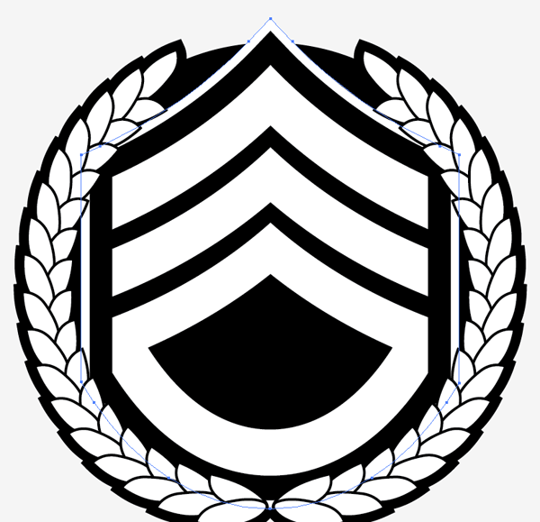
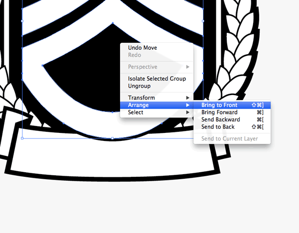
Bring the sergeant insignia shapes to the top of the stack (CMD+Shift+]) then add a 5pt black stroke. The subtle overlap helps create an interesting stacking effect and anchors the shapes together.
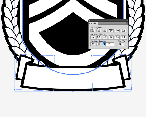
Draw another banner, this time longer in length and flowing in the opposite direction. Align this banner with the bottom of the logo and centre it with the existing shapes using the Align palette.
Adjust the stacking order of the objects to allow the emblem to overlap the banner.
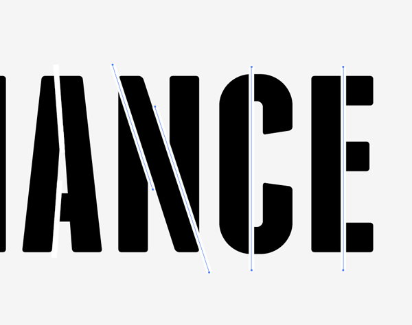
Elsewhere on the artboard type out the word Alliance in a font of your choice. I’m using Franchise, but to fit in with the military theme stroked lines are added to create a stencil effect.
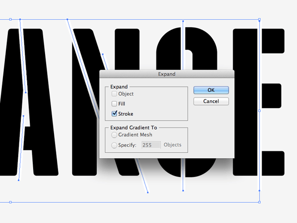
Use an original stencil font for reference as to where the breaks between the letters should appear, then carefully align the stroked lines to flow seamlessly across each letter. Select all the paths and go to Object > Expand to convert them into solid shapes.
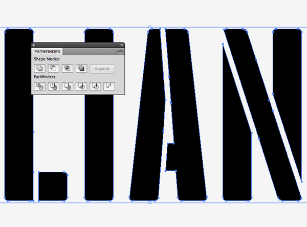
Convert the text to outlines (CMD+Shift+O) then ungroup the letters and ungroup the lines. Create two separate compound paths of the letters and the lines using the shortcut CMD+8. Select both compound paths then punch out the lines from the text using the Pathfinder tool’s Subtract option.
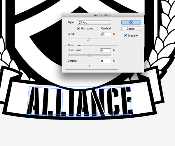
Position the text over the lower banner then add an Envelope Distort to match the curvature of the banner shape.
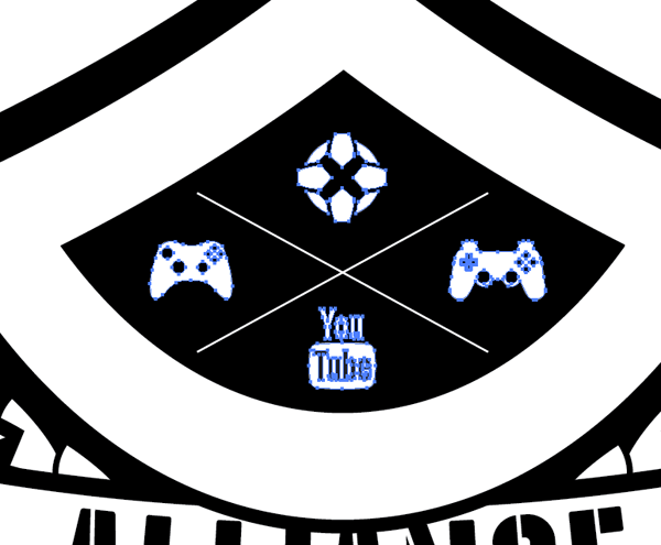
Finish off the design with a series of icons in the negative space within the sergeant emblem. I cheated here and downloaded ready made graphics from the Internet ;-)
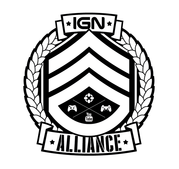
This leaves the military style emblem design complete. The large sergeant insignia and the stencil type definitely boasts the army theme while the banners and wreath help compose the logo into a neat and compact circular badge.
Download the source file