Blog.SpoonGraphics | Latest Blog Entry |
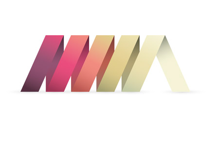
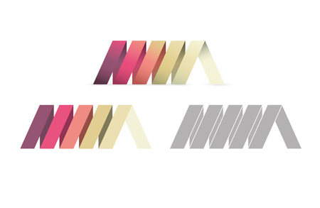
| Create a Cool Ribbon Style Logo Graphic in Illustrator Posted: 19 Aug 2012 11:00 PM PDT Follow this step by step Illustrator tutorial to create a cool ribbon style logo graphic with gradients and effects in Adobe Illustrator. We’ll create the graphic as a vector design to allow scalability as a logo and add flat and mono versions to keep the logo versatile. Usually a logo project would involve lots of research in order to develop a brand that reflects the company, but for this tutorial we’ll focus just on the practical task of building a cool looking graphic in Illustrator. The design we’ll be creating features a continuous ribbon style shape wrapping to form a spiral. View the final ribbon style logo design
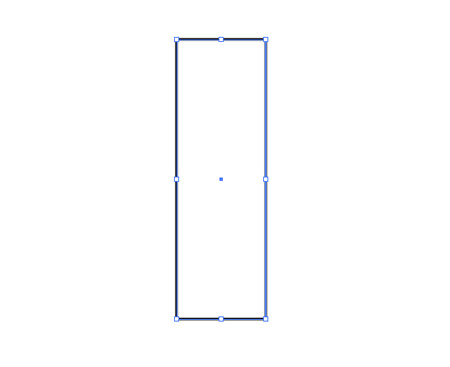
Open up Adobe Illustrator and draw a long thin rectangle on the artboard. Remember, the initial dimensions that you create your logo doesn’t matter seeing as we’re working in vector. Unlike Photoshop the design can be scaled up and down without loss of quality.
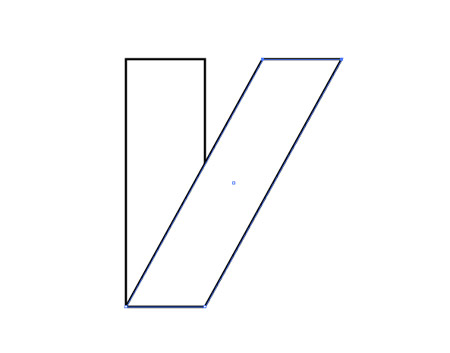
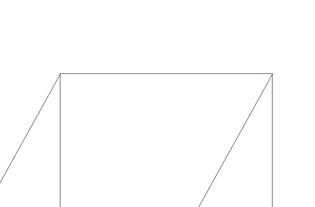
Press CMD+C to Copy then Paste in Front (CMD+F) a duplicate of the rectangle then select the top two points of the overlapping rectangle with the Direct Selection tool. Hold Shift and move these points right to shear the shape.
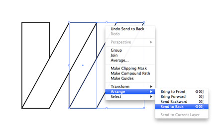
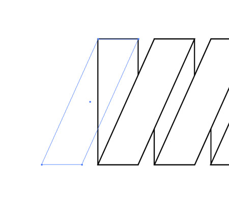
Select both rectangles and hit copy, then paste in front a duplicate. Move them into position horizontally to continue the ribbon then right click and select Arrange > Send to Back to properly follow the pattern.
Zoom right in to the document and press CMD+Y to toggle on outline mode. Select the two new rectangles and carefully line them up where they join with the originals.
Repeat the process to extend the ribbon, then add one final diagonal rectangle to finish the left edge.
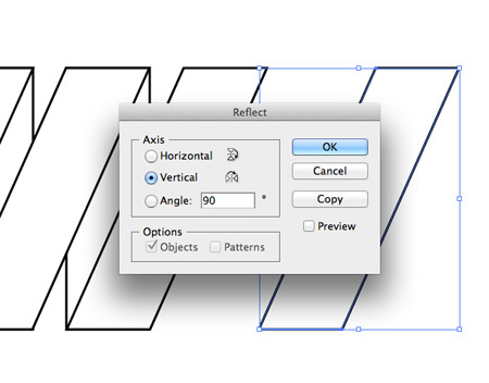
Make a copy of a single diagonal rectangle and go to Object > Transform > Reflect and select the Vertical axis to flip the shape for the opposite side.
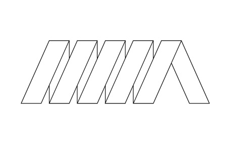
Position the flipped rectangle on the right edge to finish off the basic logo artwork.
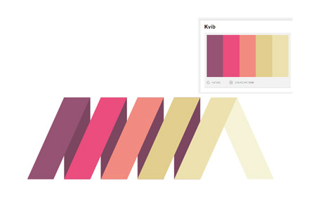
Lay out a colour scheme for your branding or download a cool palette from sites such as ColourLovers.com and begin replacing the default fill/stroke with vibrant colours.
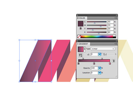
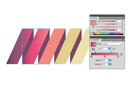
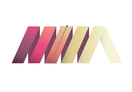
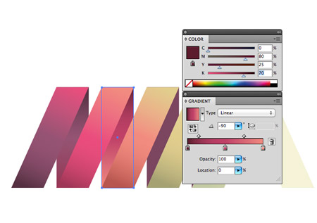
We’ll create a flat colour version of the logo later so let’s continue with the eye candy and make the logo stand out with some cool gradient effects. Make a copy of the logo then replace each segment with a gradient fill. Select the original colour as the centre handle, then choose a darker tone for the first handle and colour pick the next colour for the last handle.
Blending each colour with the next helps enhance the flow of colour across the logo, while the dark to light tones on each rectangle help give the design a slight three dimensional appearance.
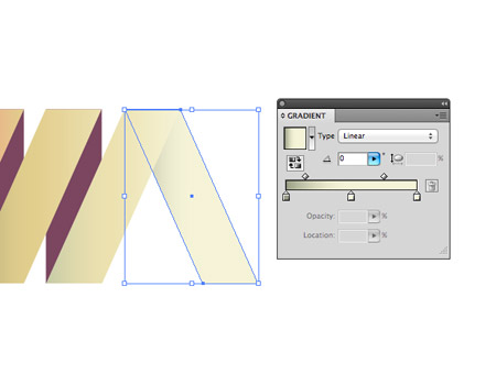
On the last piece choose the lightest colour from the palette but add a shadow effect by blending the gradient to a darker tone.
Click & drag with the Gradient tool to adjust the angle of the gradients to flow with the orientation of each rectangle to best see the blend of colour.
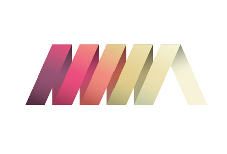
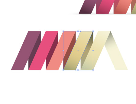
Select each of the vertical rectangles and give them the same gradient fill as the nearest rectangle using the eyedropper tool. To maintain the illusion of a spiral these colours need making darker to represent light and shade. Select each handle from the gradient and add more black to each colour to darken all the tones.
The logo design looks pretty cool with the gradient effects helping the design stand out and jump off the screen.
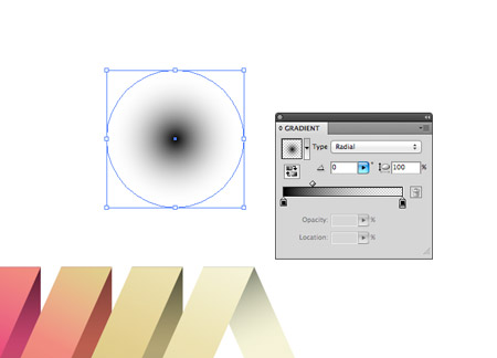
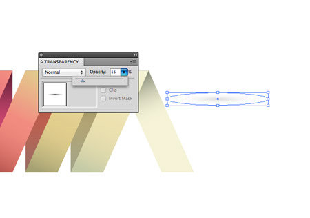
Draw a circle somewhere on the artboard and give it a black to transparent radial gradient fill. Squash the shape by dragging the top handle downwards to create a little shadow graphic.
Reduce the opacity of the shadow to around 15% then position it under one of the rectangles’ bottom edges.
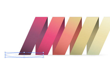
Hold ALT and Shift while dragging the shape to create a duplicate and position shadow graphics along the whole bottom edge.
The shadow effects help ground the logo and allows it to sit within its surrounding space. This is the primary version of the logo complete, but let’s quickly make flat and mono variations to keep the logo versatile.
A flat logo is useful for small scales where the gradients and effects wouldn’t reproduce well. Make a copy of the logo and remove all the gradients and shadows, leaving solid colour fills.
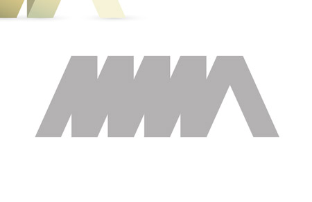
A mono version is useful for when the logo is being placed on unusual backgrounds where the primary logo would be lost. Replace all the colours with a temporary grey.
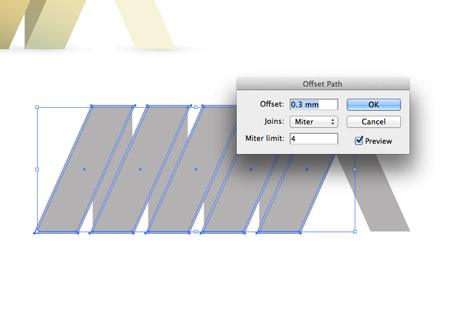
The logo loses all of its definition without a little modification. Select the diagonal segments and go to Object > Path > Offset Path. Add a small amount of offset of around 0.3mm.
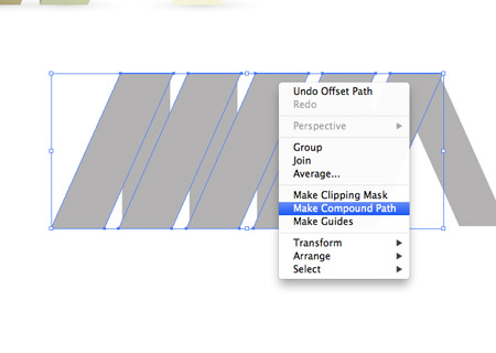
Select all the new offset shapes individually and create a Compound Path.
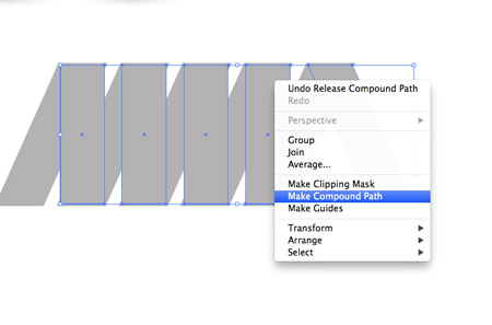
Deselect everything then select just the upright rectangles and the last diagonal segment and create a new Compound Path.
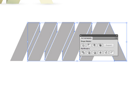
Shift-Select both compound paths then hit the Subtract option from the Pathfinder palette to punch out the offset shapes from the original rectangles to leave a stroke effect. The mono version is now recognisable and can be used in any colour. This leaves the cool ribbon style logo design complete and ready to send off to our fictional client. The primary version looks great with all the gradients and effects, and will retain its quality when scaled. Then there’s the flat and mono versions that maintain the logo’s versatility and allow it to be reproduced anywhere. |
| You are subscribed to email updates from Blog.SpoonGraphics To stop receiving these emails, you may unsubscribe now. | Email delivery powered by Google |
| Google Inc., 20 West Kinzie, Chicago IL USA 60610 | |


Aucun commentaire:
Enregistrer un commentaire