
Spoon Graphics | Latest Blog Entry |

| How To Create a Beautiful Vector Portrait in Illustrator Posted: 09 Jan 2011 11:00 PM PST I’ve always love browsing the amazing style of art known as Vexel illustration and recently I decided to finally give it a go myself. Follow this step by step tutorial for the making of my first vector art portrait of Tron Legacy’s Quorra. Learn how the portrait is carefully traced and vectorized in Adobe Illustrator to create an interesting vexel style design.
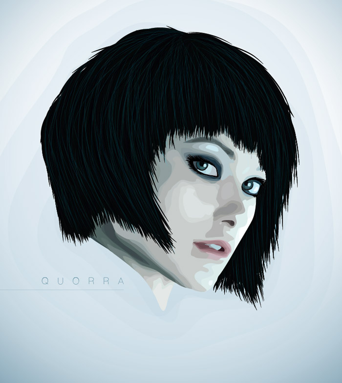
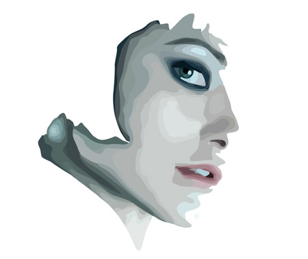
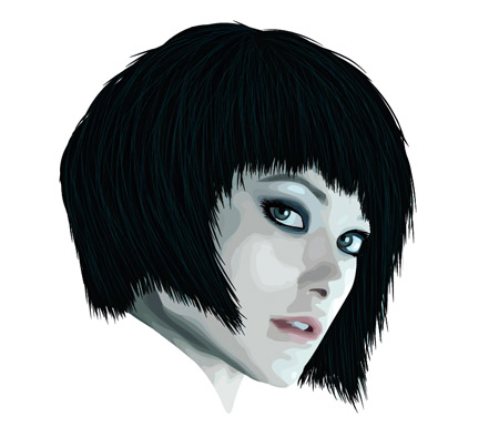
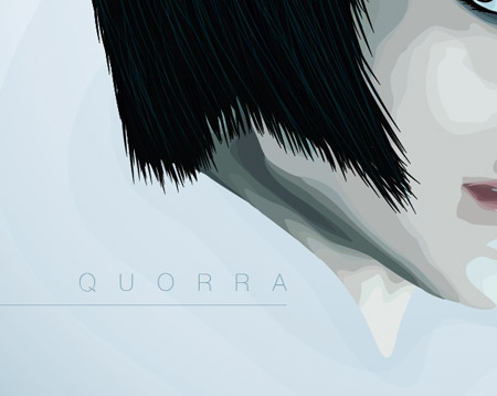
The portrait we’ll be working on features the beautiful Quorra character from Tron Legacy. The term vexel art matches the style of this illustration, where a semi-realistic image is produced from numerous layers, but to be fully recognised as a vexel illustration the artwork has to be pixel based. This design is created in Illustrator rather than Photoshop, which I think is the better tool for the job, but to keep the vexel purists happy we should refer to it as vector art. View the final Quorra vector art portrait
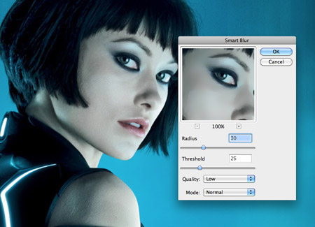
The first step when creating any vexel style portrait is to source a subject. I’m still buzzing from seeing Tron Legacy at the cinema so I’ve picked out this profile of the character Quorra. Open up the image in Photoshop and add a subtle Smart Blur to remove the finer details.
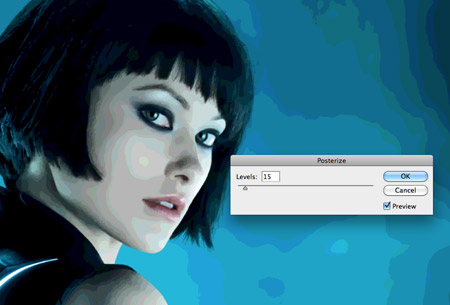
Next, make a duplicate of the layer and go to Image > Adjustments > Posterize and change the levels to between 15-20. As previously mentioned the more layers you create the longer you’ll be sat tracing, but the overall image will include a much deeper range of tones and will become hyper-realistic. Duplicate the Smart Blur layer one more time and place it above the posterized layer. Change the blending mode to Color to remove the ugly green and blue tones added by the posterization effect.
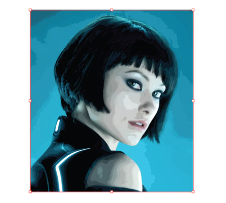
Take a snapshot of the base image and place it into Adobe Illustrator. The idea is to trace each ‘shape’ that has been produced from the posterization effect to recreate the image in vector format.
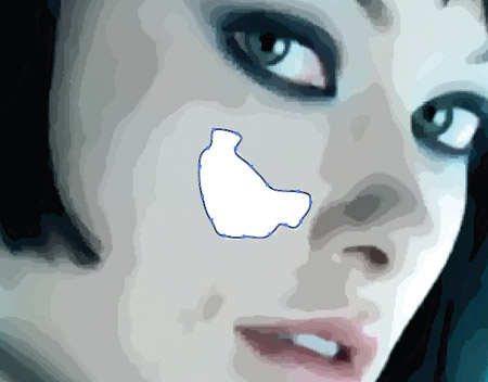
Use the Pen Tool to trace the brightest highlight on the cheek. Don’t worry about staying true to the exact outline, rounding off corners and drawing a more basic shape can often make for a better final image.
When the shape is complete, switch from the Pen tool to the Eyedropper and sample a tone from the base image. Switch out the default fill and stroke of the vector shape for this colour. Move onto the next level; trace; then sample the next tone.
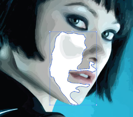
Continue the process of tracing each subsequent layer and sampling the tones from the base image. Soon the portrait will begin to take shape. As two areas of the design meet, you may need to alter the stacking order by pressing the CMD+[ or CMD+] shortcuts.
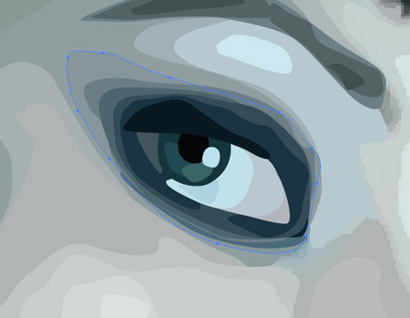
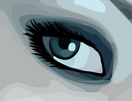
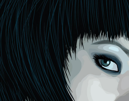
The eyes of any portrait are the most important areas, so take the time to build up as many layers of detail as possible. Notice how the whites of the eyes are more than just white – They include a range of subtle colour changes which make for a more realistic image when viewed from afar.
As the facial features are added to the portrait the design becomes increasingly recognisable, yet it maintains that cool stylised effect with the visible layers and shapes.
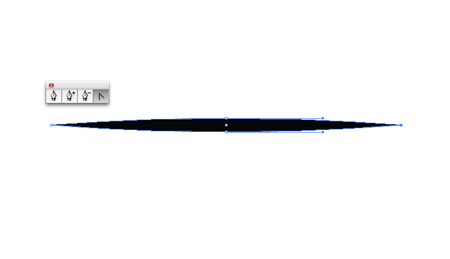
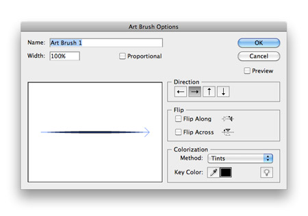
Elsewhere on the artboard draw a wide, flat oval. Use the Pen tool to convert the anchors on each end to create sharp points. Press the ‘new’ icon in the Brushes palette to create a new brush setting.
Select ‘New Art Brush’ from the options box, then change the Method to Tints. This will allow us to change the colour of the brush strokes if necessary.
Use the Brush tool along with the new brush setting to add some extra definition and detail to the eyes. Outlining the eye and drawing a series of eyelashes really helps them stand out.
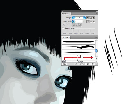
On a new layer use the Pen tool to roughly draw a shape to represent the basic hair line. It doesn’t matter too much about the awkward shape.
Use the brush tool with a 0.25pt stroke setting to draw in individual strands of hair to disguise the ugly hairline outline. If required, double click the Brush icon in the tools palette to alter settings such as ‘Keep Selected’.
Subtle highlights in the hair can be created by drawing thin 0.15pt strokes using brighter blue colours. A graphic tablet really comes in handy here.
Draw a few layers of hightlighting strokes, then change the transparency mode to Overlay and alter the opacity of each layer to tone down their prominence.
The portrait is really taking shape now the facial tones and hair are complete, so let’s finish off the design with a cool background.
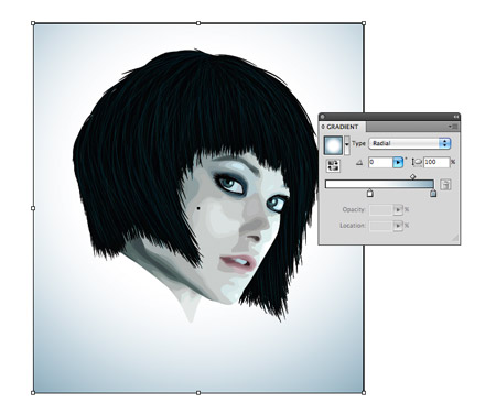
Draw a rectangle to enclose the design and send it to the bottom of the layer stack. Add a radial Gradient fill using soft blue tones from the portrait.
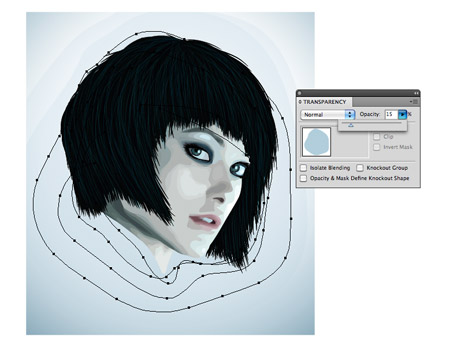
Using a range of vexel style contour shapes in the background helps complement the style of artwork used in the portrait. Change these shapes to 15% opacity to tone down their prominence so they’re hardly noticeable.
A simple line of text finishes off the design nicely. Here I’ve added the name ‘Quorra’ in ulralight Helvetica Neue with super high tracking, neatly underlined with a thin border.
The whole process can be a little tedious, but with patience it can be relaxing to get your head down creating simple shapes for hours on end. The final artwork makes it all worth it, especially if you take the time to create a super realistic design with numerous layers. |


| You are subscribed to email updates from Blog.SpoonGraphics To stop receiving these emails, you may unsubscribe now. | Email delivery powered by Google |
| Google Inc., 20 West Kinzie, Chicago IL USA 60610 | |
Aucun commentaire:
Enregistrer un commentaire