Blog.SpoonGraphics | Latest Blog Entry |
| Blog.SpoonGraphics Redesigned. Welcome to Version 6 Posted: 05 Nov 2012 07:38 AM PST I can’t believe it has been 3 years since the last redesign of this blog, but over the past couple of months I’ve been working on version 6 of Blog.SpoonGraphics. I went through many concepts for this one ranging from complete overhauls to subtle realignments, but I settled with something roughly in the middle with a new layout that retains the brand and style of the original 2007 design. Some history
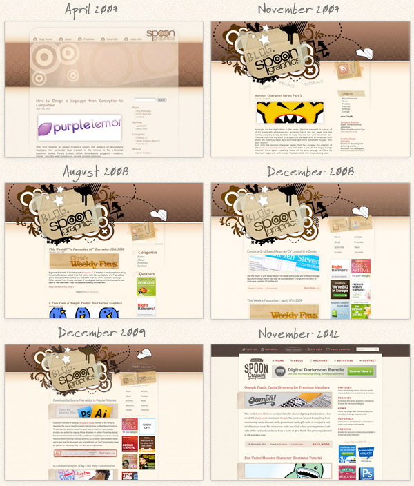
Since its creation in 2007 this blog has worn pretty much the same outfit, with slight adjustments and realignments being made every 6-12 months. The last redesign in 2009, despite looking very similar was a complete rebuild from scratch with updated code and lots of finishing touches added to the layout. That version lasted pretty well over the last few years, but I started to feel like a complete overhaul was needed and began working on various design concepts for a fresh look. What’s new?
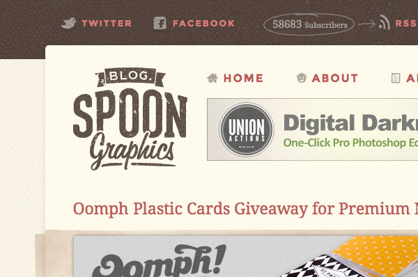
This blog has always had a kind of retro/vintage theme with the browny/beige colour scheme and paper textures. After trying out a few completely out-of-the-box designs I decided it would be best to stay true to this theme, so I took it back to square one and developed a new vintage style logo to tie it all together.
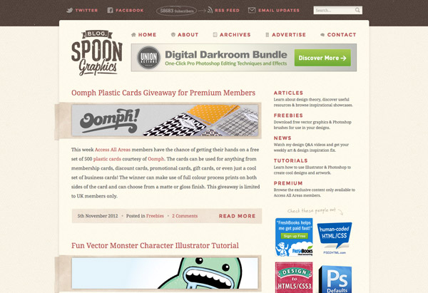
I really wanted to widen the content area, but I was a bit worried about the 5 years worth of content that had already been scaled to the old 450px layout. I decided to bite the bullet and widen the main column to 600px, so all posts from now on will feature much larger screenshots and imagery. Those old posts based on the 450px layout don’t actually look too bad, they just sit centrally on the page while the body copy extends to the full width.
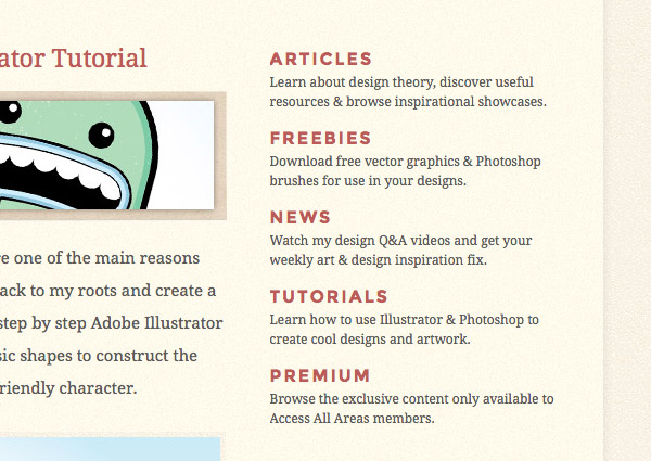
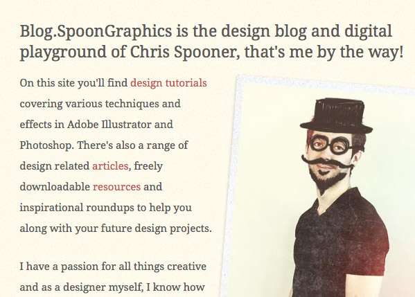
The new design is really just an evolution of the old layout. Pretty much everything is still in the same place, but with simple restyling. Ermahgerd it’s nert responserv
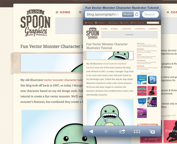
One of the main dilemmas I had was whether or not to make this blog design responsive. From my own browsing experience I often find responsive designs more of a nuisance than a benefit (with exceptions). Almost all my posts are very long and made up of multiple images. With a responsive design those images would be scaled down and you wouldn’t be able to zoom in to see the details in the tutorial screenshots. Plus with everything permanently zoomed at 100% you would be forever stroking your device to make it to the bottom of the page. Still testing!I’ve done my best to get the design to display properly across all browsers and devices, but I don’t have the ability to test them all. If you come across any glaring errors I’d love to hear from you (a screenshot would also be super handy!). Let me know your thoughts on the redesign down in the comments. Is there anything I’ve missed or anything you would have done differently? |
| You are subscribed to email updates from Blog.SpoonGraphics To stop receiving these emails, you may unsubscribe now. | Email delivery powered by Google |
| Google Inc., 20 West Kinzie, Chicago IL USA 60610 | |


Aucun commentaire:
Enregistrer un commentaire