Blog.SpoonGraphics | Latest Blog Entry |
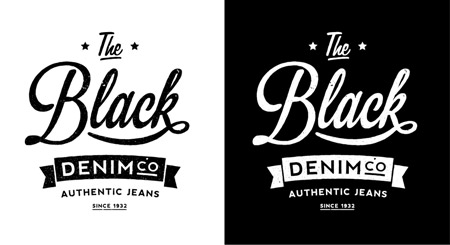
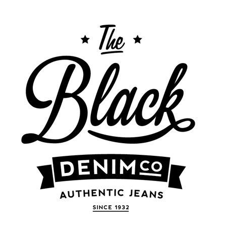
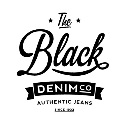
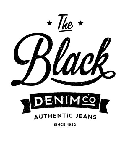
| Create an Aged Vintage Style Logo Design in Illustrator Posted: 14 Oct 2012 11:00 PM PDT Follow this step by step Illustrator tutorial to create an aged vintage style logo design. We’re going to take inspiration from generations past, when logos were hand crafted with custom lettering. To achieve the same effect in Illustrator we’ll customise existing fonts to create a old school layout of cool typography. The vintage logo we’ll be creating is based on a fictional jeans company Black Denim Co. The logo uses some of the classic design tricks from the 30′s, 40′s & 50′s to capture that old school look and is finished off with some distressed textures to represent the low-fi print techniques used by our ancestors. View the final vintage style logo design
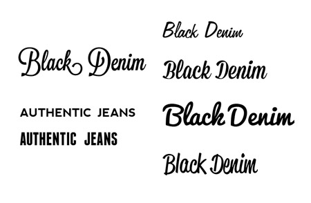
Classic logos were all about the typography. They often used a mix of hand crafted scripts and bold sans-serif lettering. Browse over your collection of fonts and compare the different styles to find one that matches the 30′s, 40′s & 50′s eras of advertising and branding.
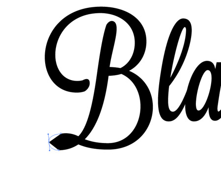
I’ve selected the Lavanderia font, but I’m not too keen on the flat edges. So why not customise it? Convert the font to outlines in order to manipulate its shape, then use the Pen tool to add in an extra point on the flat edges and adjust the bezier curves.
The difference between the customised and the original is only subtle, but it helps create a unique design that fits the style we’re aiming for.
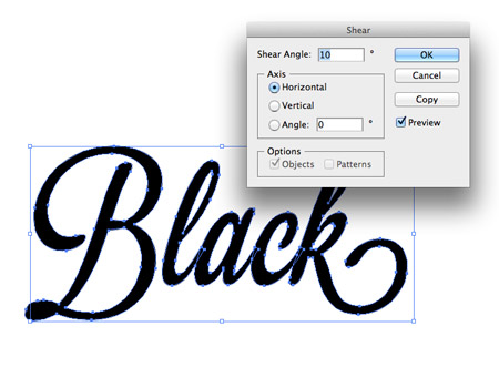
The current font seems a little too upright compared to other old school script logos, so go to Object > Transform > Shear and add 10° to the Horizontal axis.
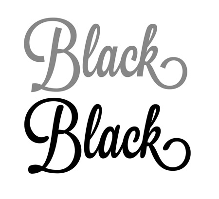
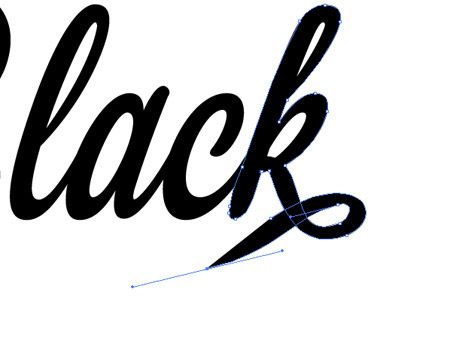
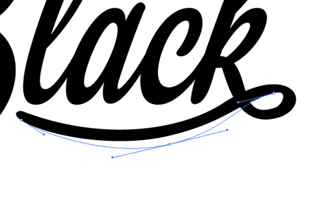
Use the Direct Selection tool to delete out the whole tail from the letter K, then use the Pen tool to continue the paths from the open points into a looping shape that underlines the text.
Lots of careful tweaking of points is required to perfect the shape and eliminate unwanted kinks. Keep in mind how the line would be formed with a pen nib and try and represent the difference in line thickness.
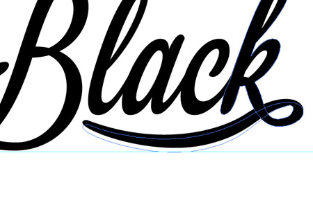
Use guides to align the loop to the rest of the logo to help it blend in and balance the design.
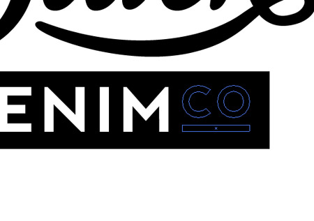
Use a contrasting sans-serif font to lay up the ‘Denim Co’ portion of the brand name. Here I’m using the Nevis font in a black rectangle. Be inspired by history and reuse tricks from old logos, such as the layout of the word Co.
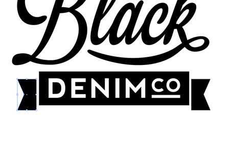
Add a narrower copy of the rectangle alongside the original then move it downward a few nudges. Add an extra point on the outside edge and move it inwards with the Direct Selection tool to create a banner style shape.
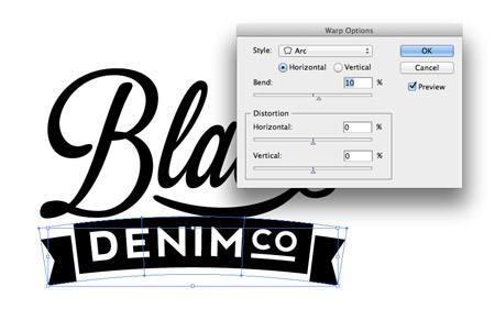
Select all the objects that make up the banner and go to Object > Envelope Distort > Make with Warp. Select the Arc setting and add 10% of Vertical adjustment.
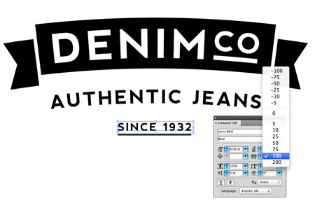
Add an old school tagline underneath the logo. “Authentic”, “Original”, “Purveyors of” and “Est.” are classic examples. Adjust the tracking of the text to increase the spacing between the letters.
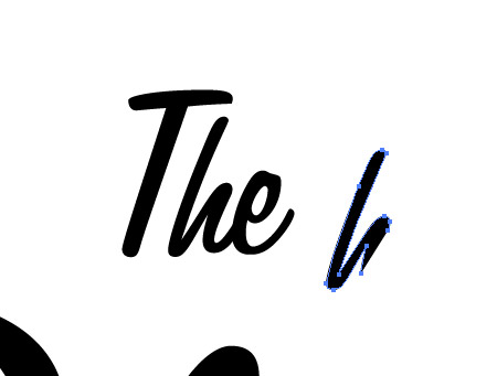
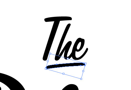
Above the logo make a copy of the letter H from the word ‘The’ in another script font. Delete all the points to leave just a straight line.
Rotate and place this single line to under line the logo. This shape fits much better than a custom shape drawn with the pen tool seeing as it already has matching curves.
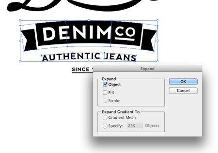
Select the elements that have been adjusted with Warps and go to Object > Expand. Select just the Object checkbox to convert these elements back into solid shapes.
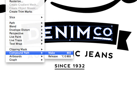
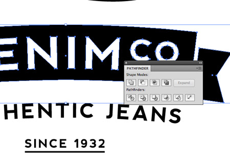
Ungroup, then select the wording from the banner portion of the logo and create a compound path. Do the same with the three elements that make up the black banner graphic.
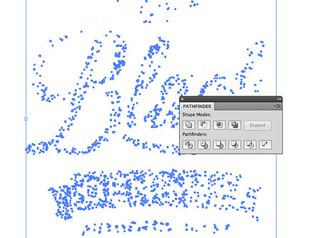
Select the two compound paths and hit the Subtract option from the Pathfinder palette to punch out the text from the banner.
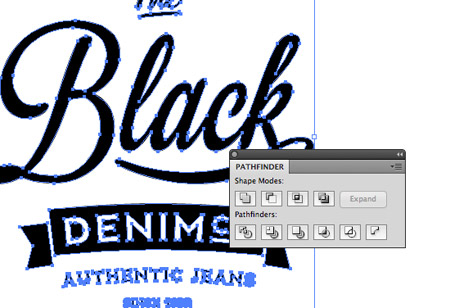
Convert any remaining text to outlines then select all the elements and Merge them together with the Pathfinder to convert the design into one single shape.
The final logo layout has everything you could expect to see in a vintage style brand, but no vintage design would be complete without some distressed textures to create that aged and weathered effect.
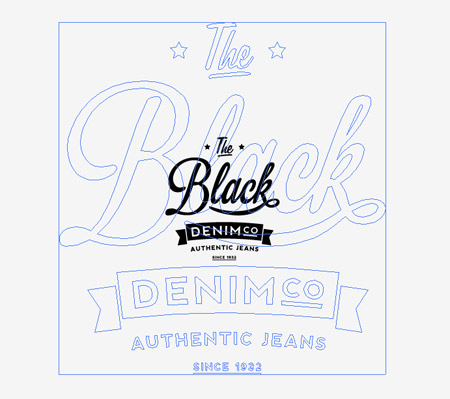
Scale the logo up by a few hundred percent, so it’s considerably larger than its original dimensions.
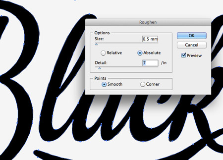
Ungroup the logo and select the main three text elements. Go to Filter > Distort & Transform > Roughen then alter the settings to around 0.5 Size, 7 Detail, Absolute and Smooth.
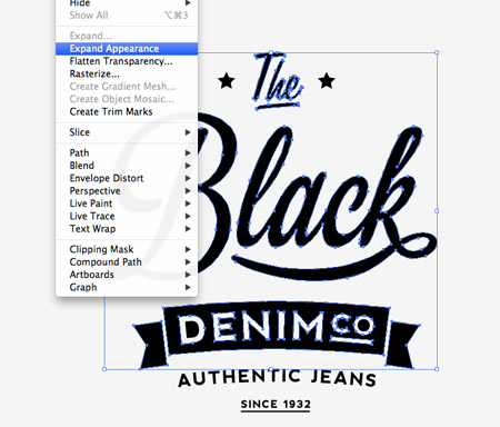
Next, expand their appearance under the Object menu. This will replace the crisp edges with irregular lines. Adding this effect on the smaller text would distort them too much, so it’s only applied to the larger elements.
Scale the logo back down to its original size. The roughen effect is scaled down with the logo and creates a very subtle bleed effect that represents the old stamping and press printing techniques. Hat tip to Simon Walker for this cool technique.
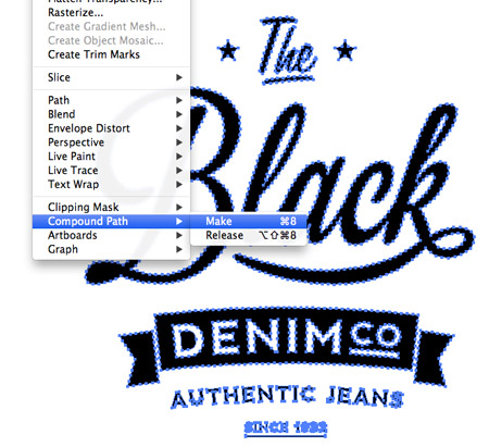
Right click and ungroup the logo then add all the elements to a Compound Path by hitting the shortcut CMD+8 (or selecting the menu option).
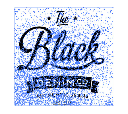
Paste in a distressed texture from my vector bumper pack and scale it to size over the logo. Right click, ungroup and create separate a compound path for the texture element.
Instead of punching out the texture from the logo, I like to Intersect the text from the texture to keep the two elements separate. To do this send the texture to the back and use the Intersect option from the Pathfinder palette. Copy the result then press CMD+Z to bring back the text. Press CMD+F to paste in the texture over the text and change its fill colour to white.
The subtle rough edges and the vector texture file really adds to the vintage appeal of the logo and gives a fantastic hand crafted stamp effect.
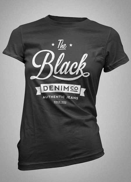
Our vintage style logo looks cool on screen, but get it printed on tactile objects such as apparel, labels, tags and stationery to really bring the brand to life. |
| You are subscribed to email updates from Blog.SpoonGraphics To stop receiving these emails, you may unsubscribe now. | Email delivery powered by Google |
| Google Inc., 20 West Kinzie, Chicago IL USA 60610 | |


Aucun commentaire:
Enregistrer un commentaire